Conceptual design and design direction to create a mobile experience for GovernanceMinder.
Entitlement managers can rapidly review and act on assigned tasks in mobile-appropriate sessions.
Project Background
During the work done to overhaul the GovernanceMinder web application, it became apparent that there was an underdeveloped opportunity within the product’s user experience scenarios.
Ripe With Potential
From the original research, it was known that:
- Compliance required people to review and approve entitlements on a frequent, regular basis.
- The majority (greater than 81%) of review actions were straightforward and resulted in an approval.
- Managers considered the review process to be “something they have to do, but tedious and gets in the way of other tasks they need to do” (user feedback).
Furthermore, there was the “one-off,” or intermittent, case.
Outside of a certification campaign, it is not unusual for an employee to need a new access privilege, or a new employee to need multiple new privileges during onboarding. In these situations, time is a greater factor than it normally is — that employee may be blocked from their own work without the privilege grant.
This situation was not well covered by the main (web/desktop) application experience.
The Mobile Opportunity
The zeitgeist at this time embraced a zealous push to explore the new frontier of mobile apps. Mobile was still relatively young, and new ideas were evolving constantly. Because of this, mobile experiences did not yet have the accumulated dogma and expectations that were inherent to desktop/web applications.
Within the enterprise ecosystem, market conditions signaled broad potential mobile usage:
- 91% adoption of mobile (phone and tablet) in enterprise users.
- Customer sentiment demanded a mobile aspect to business apps.
- No competitive application had a mobile experience.
In addition, a combination of elements intrinsic to mobile — anytime anywhere access and personal notifications — provided an excellent answer to the intermittent entitlement request case, as well as for general usage. A mobile experience could empower users to process their assignments in short sessions at any time that they choose, during otherwise idle time when they have their phone with them. Consequently, this would convert one large burdensome review tasks into multiple smaller, more manageable tasks.
Because of the potential for a high profile solution that would advance the internal level of experience with mobile, the product design team independently designed the GM mobile app as a proof of concept.
Project Roles
Since this was a strategic design project for the product design group, conceived and proposed by the product design team itself, I led the overall mobile app user experience design, working collaboratively with the redesign project design lead, interaction designer, and visual designer.
Building the App Concept
Through collaborative work, the design team constrained focus to the user’s personal review process at the center of the entitlement management and built the mobile app around that, adding only the necessary supporting features that fit into the mobile context.
The resulting app was laser-focused on:
- Viewing entitlement details
- Approving/denying a request
- Viewing current task/assignments list
- Alert notification of new assignments
- Personal dashboard of task status
All other features, as well as the application administration, were kept in the primary web/desktop application.
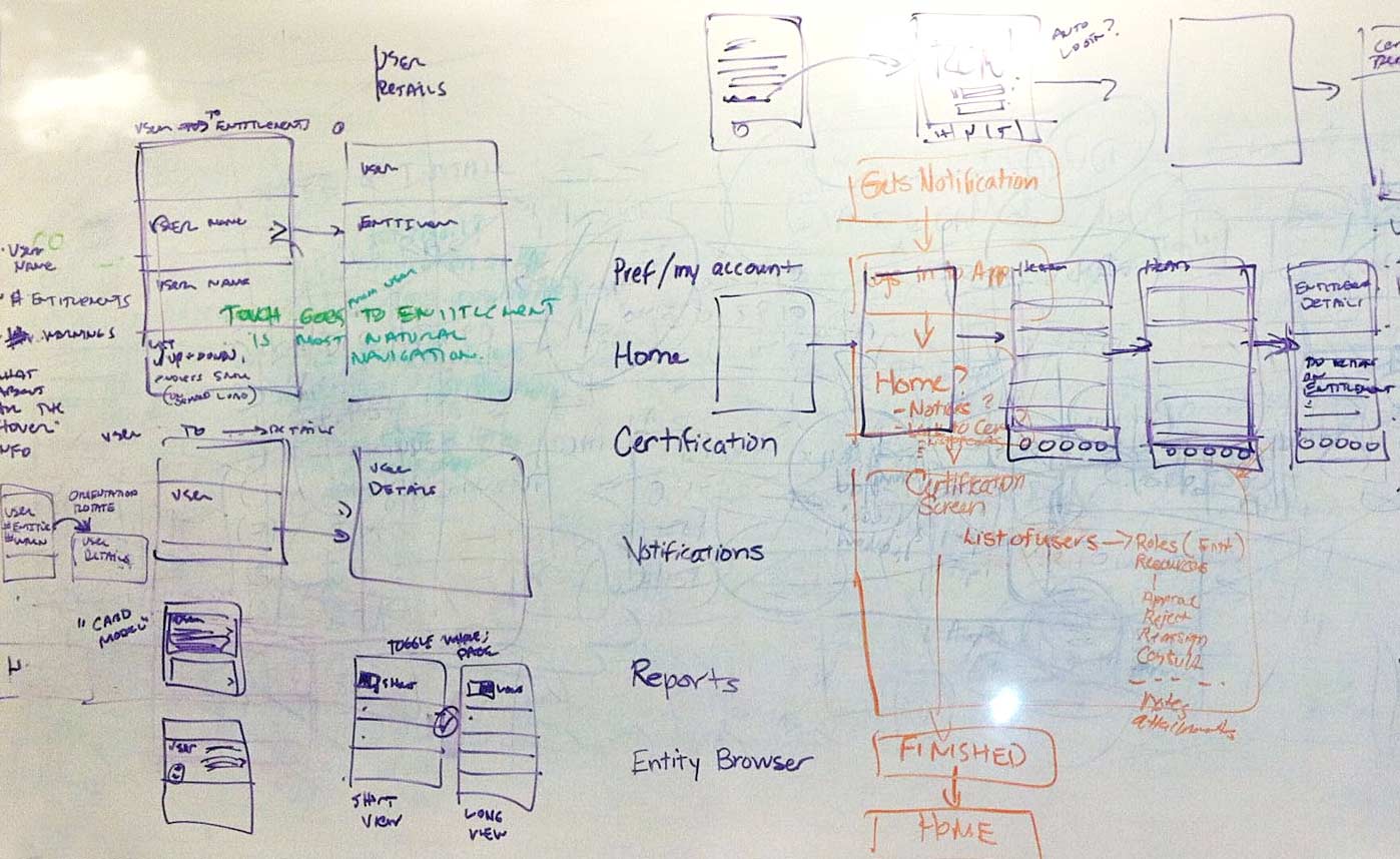
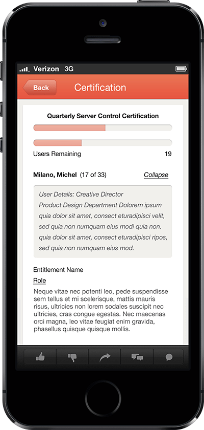
Layering
While the main web application used paginated lists to present the user’s entire list of review assignments, the mobile concept pivoted this and reimagined the organization in a way more suitable to the mobile context.

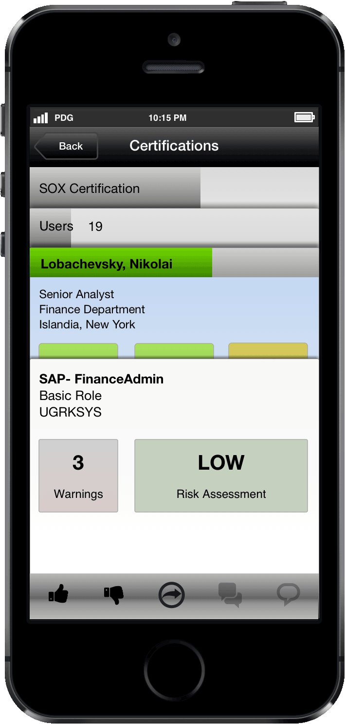
Using a card-like metaphor, the hierarchy of each review was presented as stacked layers so that the user would always be able to understand their location in the structure. Integrated progress bars and task status coloring provided additional dimensions to the communication and increased the information density.
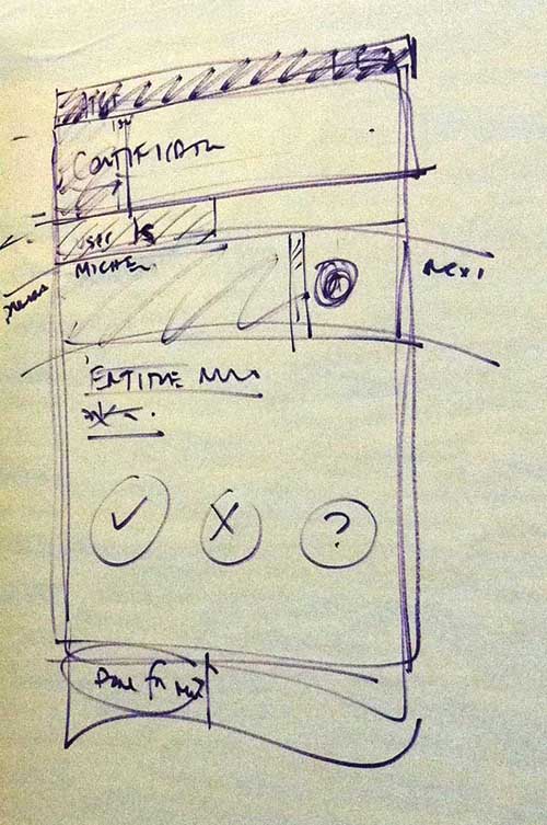
The last (i.e. topmost) layer would always be the single entitlement that needed to be reviewed and then approved or denied. Standard buttons were available at this level, using “thumbs up” and “thumbs down” imagery to convey an informal and personal attitude, compared to the respective “approve” and “deny” labels. But since this was mobile, more was possible.
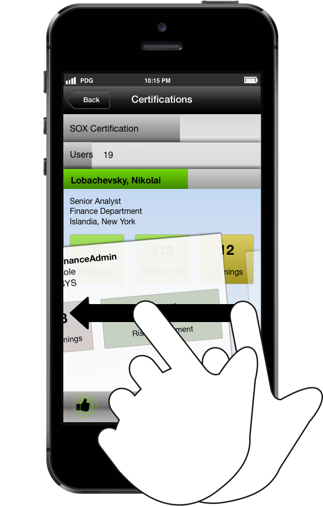
A Gesture of Approval
Common gestures move up and down in the stack were first added for navigation. Then, inspired by new experiences in consumer mobile apps, gestures-based decision making was added so that the user could swipe right or left to approve or deny (respectively) the entitlement. This added a new dimension to the process in speed, engagement, and user satisfaction. It injected enjoyment and playfulness into the enterprise.
Project Outcome
After applying the concepts and an iterative build-out of the main application screens, a prototype was created to demo the ideas.

Working with the GovernanceMinder product management team, the mobile prototype was presented to a national broadcast company customer for validation and customer feedback. Their enthusiastic response: a USD 2.75M software license contract (renewal) as a pathway to beaing able to use the mobile application.
On the basis of this positive result, a mobile app proposal was written and presented to the internal executive project review board, where it was approved for a funding round to move to the next phase of development. At that point, the project was transitioned to a different design team to realize the vision.