User-centered redesign of the issue tracking application at the core of the CollabNet collaborative environment.
Project Background
CollabNet Enterprise Edition was a Saas and on-premise turnkey environment for collaborative software development, used by both enterprise organizations e.g. Department of Defense, Motorola) and open-source communities (e.g. Subversion, Java.org).
Project Tracker, the flagship component in the platform, was a customizable project “artifact” tracking application. The main purpose of Project Tracker is to manage and monitor software development issues and bugs, while the configuration capabilities make it possible to manage requirements, tasks, feature requests, or anything that could be defined in a structured manner.
Project Results
A prototype was developed and shared with select groups of existing users (software developers) for exploration and testing. With the new design, the results were wholly positive:
- 43% faster time to completion
- Improved customer happiness
- Fewer entry mistakes
Why Redesign? Project Tracker Problems
Project Tracker had not had any holistic user experience attention since it was first created. In that time, a number of events had occurred:
- Feature-driven work grafted on numerous new capabilities without integrating them cohesively.
- Defect fixes addressed immediate concerns but not fundamental problems (i.e. short-term fixes).
- The competitive landscape evolved and overtook Project Tracker.
The Project Tracker redesign effort was conceived and initiated as a way to bring together design insights, customer needs, and best practices to craft the application into a modern and improved tool.
As a project, it was not limited to a single release but defined a roadmap that would span multiple releases, permitting agility and more realistic implementation (versus a monolithic development cycle).
Design Goals
Specific design goals guided and oriented the work and the priorities for the project.
- Simplify
- Reduce effort for high-usage tasks
- Improve clarity and consistency of communication
- Give the user more control
- Improve the visual appeal
Scope of the Redesign
All of the task flows in Project Tracker were redesigned:
- Enter a new issue
- View and change an issue
- Search for an issue
- Reports
- Manage (create, edit, delete) issue types
- Manage (create, edit, delete) issue fields
Focus: Entering a New Defect
This project story focuses on the specific task of entering and editing a new defect, using the default out-of-the-box defect (aka “bug”) configuration, and covers the process from the typical starting point to viewing the newly created defect.
User Flow
The user flow, comparing original vs. new, shows the simplifed interaction architecture for the "enter new defect" sequence.

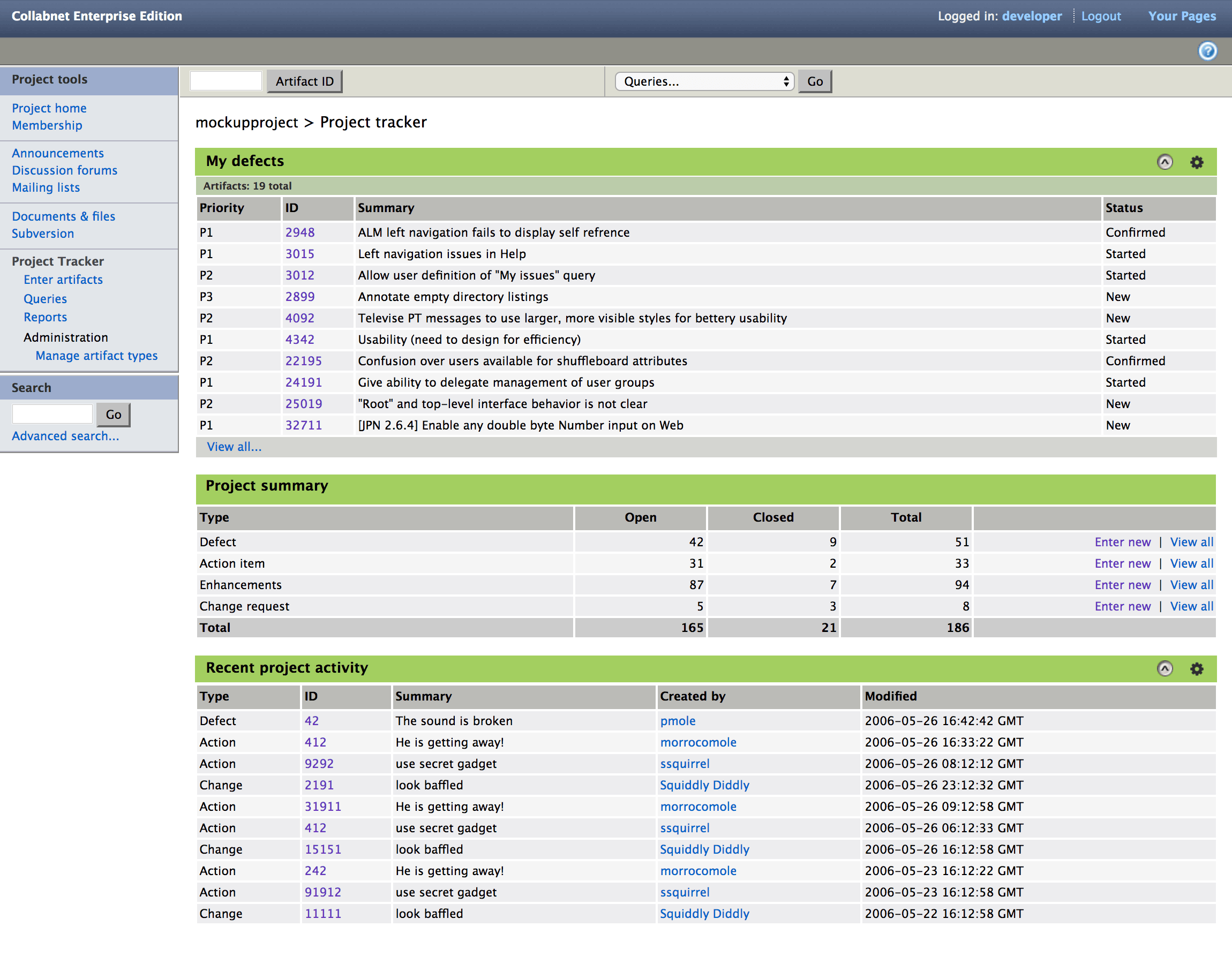
Project Tracker Landing Page
The landing page is the tool’s “home” page (within the platform environment). It is the first page that users access when using Project Tracker, and the typical starting point for creating a new issue.
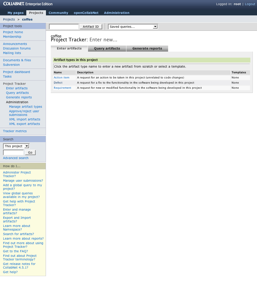
Problems
- Empty page
- Empty landing page offers little value and is a lost opportunity to provide value.
- Confusing page defaults
- The page defaults to what the person last did in the tool (i.e. entering a new artifact, querying, or making a report). This confused users — it did not map to their expectations or typical workflow.
- Tabs are misleading
- The three functions represented as tabs are not actually connected to each other. They are independent actions, and there is no communication between those actions (passing fields, etc.). This frustrated people.
Also, the visual meaning of tabs is inconsistent with the rest of the platform, adding to the confusion.
- Tabs are redundant
- The tab actions are already available in the main navigation.
Solutions
- Value for the user
- An at-a-glance overview of what is in the project, with personalized content. This makes the requisite landing page immediately useful and valuable.
- Info people want
- “My active defects” is the most common query by users. Making that information the default content on the page reduced users’ time and effort. Satisfaction increased.
- Project summary
- The aggregate “Project Summary” is not available anywhere else in the application — its inclusion addresses many long-standing user requests.
- Predictable page behavior
- The user can confidently know the page will behave consistently and to be up-to-date.
- Tabs eliminated
- The new design removes the tabs, eliminating confusion and conflict with the application-wide navigation.
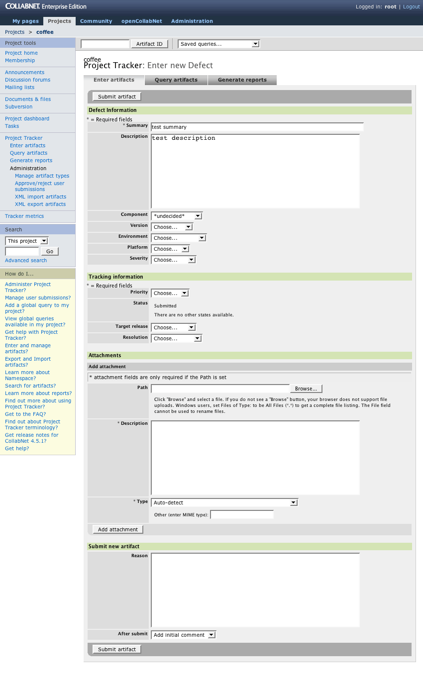
Enter New Defect, Step 1
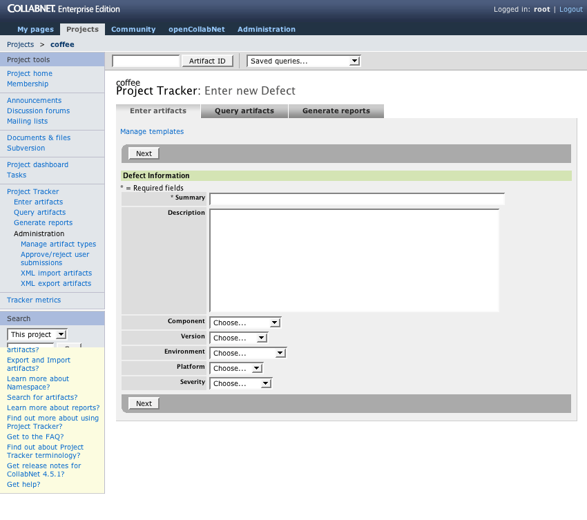
Problems
- Navigation tabs are (still) displayed
- Visual disorder: form fields
- Inconsistent field widths create visual distraction by incoherent positive and negative spaces. The user has difficulty “reading” the page because of the visual noise.
- Layout is not matched to the audience/user
- The existing layout uses a fixed single-axis format, labels on the left and the form fields on the right. Although this is an easy layout, it is overly simplistic and does not use the screen space well. The audience of this application wants maximum efficiency.
- Entry fields are not responsive
- The form fields do not adapt to the user’s screen width or the amount of the text entered.
Solutions
- Two-column layout
- A two-column layout is created using a simple, fail-safe, algorithm. Since it is done programmatically, the ability to customize the fields is maintained (e.g. admin users can add and remove fields for different issue types).
- Focus
- The tabs are removed so the user can focus more directly on the task. This is the first step on the path of narrowing task focus to benefit the user.
- Reduced user effort
- Only those fields that are necessary and relevant are displayed on the entry screen. Example: the tracking and lifecycle values are irrelevant when a defect is entered — they do not need to be on screen until the defect has moved to later states in the workflow (e.g. verified, accepted, started). This lowers the effort required for entry and improves focus.
- User assignments and attachments can be added right away
- Users can be assigned to the defect, and attachments can be included immediately without additional navigation. This aligns with user expectations and needs. For example, an interface defect will need a screenshot attachment.
- Adaptive widths
- Fields are given a minimum width that is greater than or equal to 75% of the values. This establishes a stable visual appearance while supporting internationalization.
- Improved form usability
- Form labels are redesigned for an improved look and quicker parsing by the user. The primary action button (submit) is visually separated from the other buttons.
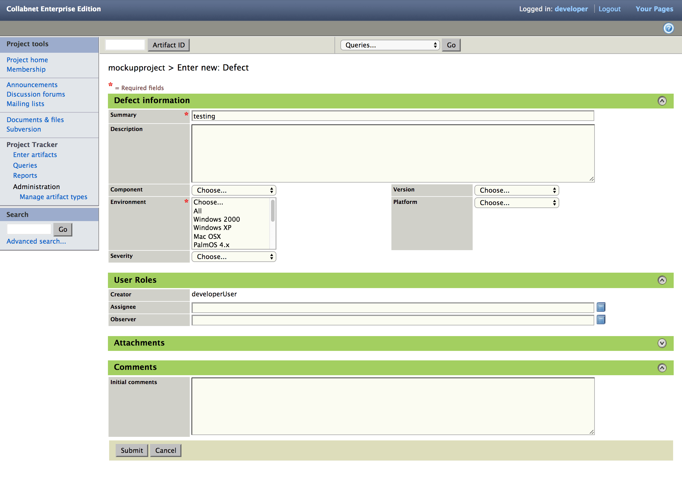
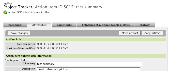
Enter New Defect, Step 2
Problems
- Multiple steps before item is created
- A person is required to work through multiple pages before the defect is actually created. People found this confusing and often lost work because they expected it to be created after the first page.
- Navigation tabs are (still!) displayed
- No team roles
- Team associations (e.g. owner, QA contact, etc.) are not available as part of the entry process. Since user assignments and roles are a core part of workflow, this was a critical issue for customer teams.
- Redundant “required fields” legends
- In each group of fields, the “required fields” caption is displayed because the rendering logic was not built to consider the whole page. This wastes attention and vertical space.
- Overly complex and technical "Add Attachment" process
- The function to add an attachment is much more complicated than users expect or need. The “Type” field requires the user to select a mime-type. Users should not have to know the mime-type — the application should do this work.
- “After submit” confuses people
- The presence of the field here requires a user to answer questions about what to do next before knowing if the defect was actually successfully entered.
Also, form fields are used as navigation.
- Unbounded length
- All possible fields in the defect are always displayed. As the defect definition grows to include additional fields, the page length also grows.
Solutions
- Simplification — No step #2!
- Submitting the defect is changed into a single-page task, simplifying the cognitive load on the user and keeping the attention focused on the main activity.
“Reason” and “After submit” are also eliminated from being required before entry.
Confirmation
When the page is submitted, the defect entry is created. The view refreshes, and the confirmation message is displayed.
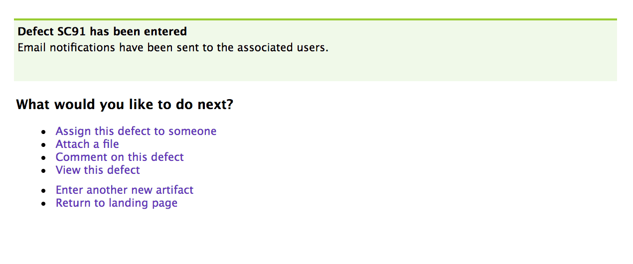
Problems
- Lost message
- The confirmation message is small and easily missed at the top of the page. Communication that the action was successful is unclear, and the user is uncertain about what is happening.
Solutions
- Clear message
- Once the defect has been submitted, validated, and is actually in the system, an unambiguous confirmation message is displayed using established visual styles.
- Focused assistance: What would you like to do next?
- At this point, the user has completed their task, and can think about the next steps. The application presents appropriate choices in a clear, friendly manner that supports rapid recognition and decision making. The actions listed are chosen based on usage frequency.
Edit/View Issue
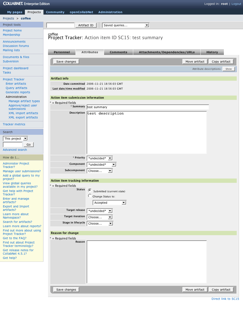
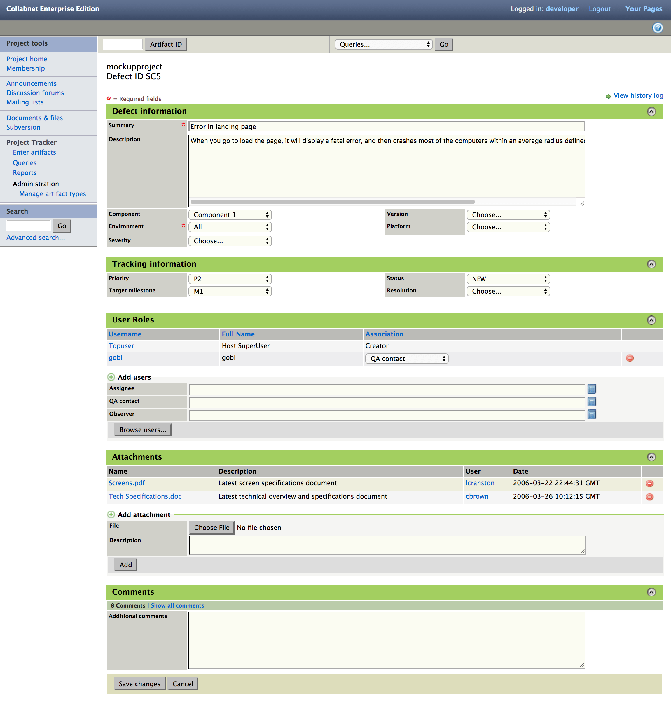
Problems
- View is not comprehensive
- Instead of presenting a comprehensive view of the defect, the information is split into tabbed segments, requiring multiple clicks to view required details.
- Organization is arbitrary
- User research established that people do not hold a workflow distinction between fields such as “Priority” and “Assignee.” However, the application separates these values onto different screens, forcing a workflow on the user. This separation is an arbitrary historical decision, made without user feedback.
- Unbounded length
- All possible custom fields in the defect are displayed. As the defect definition is customized and grows to include new fields, the page length also grows.
Solutions
- Single page
- All of the primary fields are available on a single page for review and editing, including assignments, attachments, and comments. Reduces the time and effort required from the user.
- User control over what is displayed
- With expand/collapse functionality (via unobtrusive Javascript), sections can be displayed as needed when viewing or editing. These states are maintained across visits, so that once a section is collapsed it remains collapsed to support the user’s personal habits.
- Text areas keep text readable
- Using capabilities that degrade gracefully, the text areas will grow if the text extends beyond the default height of the field. This allows the user to review all of the text efficiently.