Rethinking and reinventing the application "Home" page.
Customization and a palette of components changed the page into a personal dashboard showing work, activity, and metrics of social collaboration.
The new dashboard also established a framework for sustainable future expansion.
About the Original Page
When you log into Alpine Chorus, the first view displayed is the home page.
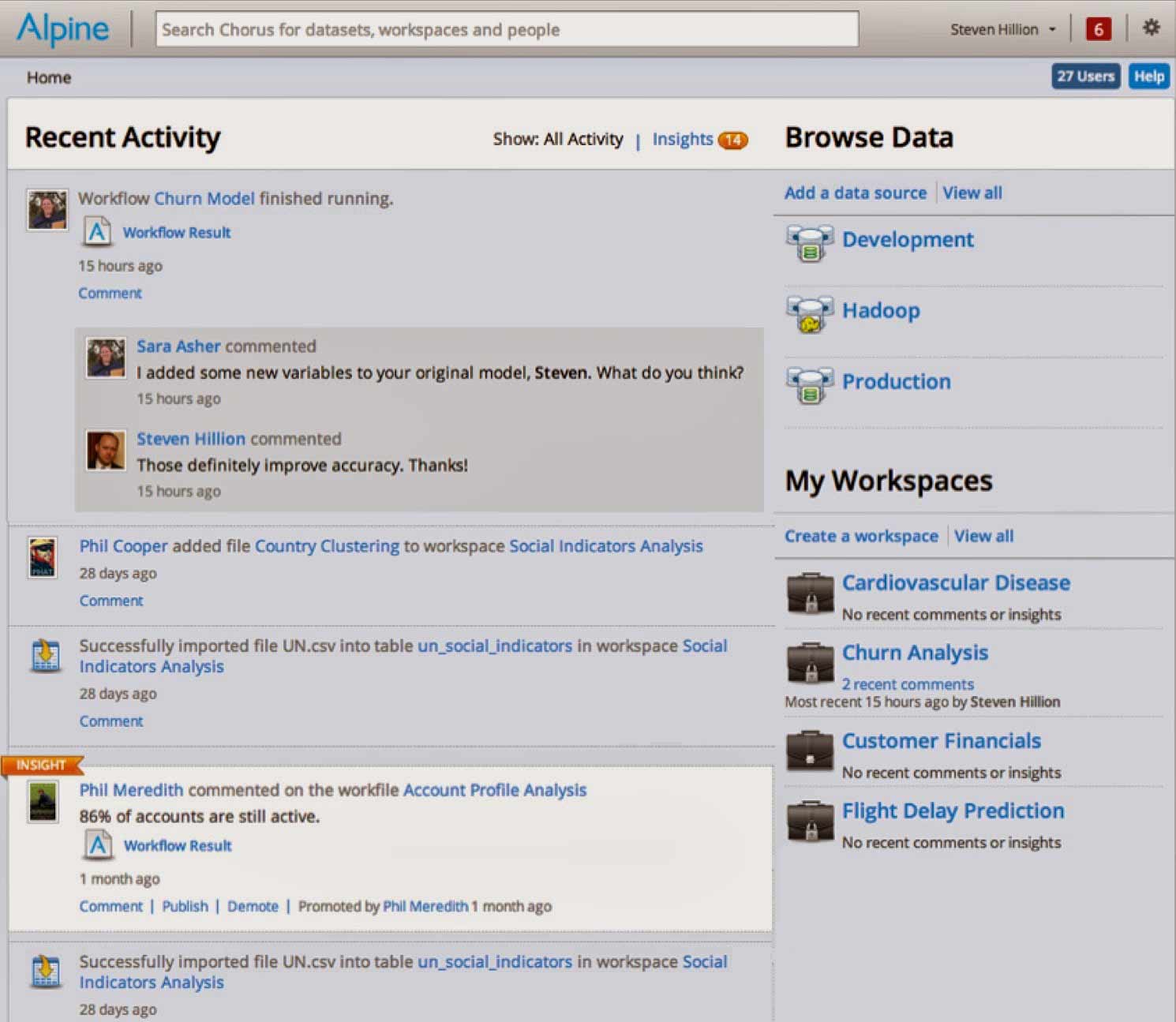
The legacy home page was acting as an aggregate information page, but was cluttered, embedded the application navigation within the content, and was awkward to use. It delivered little value in the day-to-day user experience.
The redesign project (see Alpine Chorus Strategic Design) extracted the application navigation and replaced it with a ubiquitous navigation menu. Once this was done, the home page could be torn down, reconceived, and refashioned anew.
Design Concepts for a New Dashboard
“Dashboard” was construed to be a location (a page) that provides the user with an overview of what they are doing and what is happening in the application, as well as access to the work they are doing in the application.
This aligned the dashboard with the business value of the platform as a collaborative environment for data analytics, and defined it as a specific class of dashboards — rather than displaying strategic or operational metrics, it should be personal and activity-centric information.
The concept of the page was then distilled into two clear principles.
Dashboard Page Design Principles
From this focus, the solution coalesced.
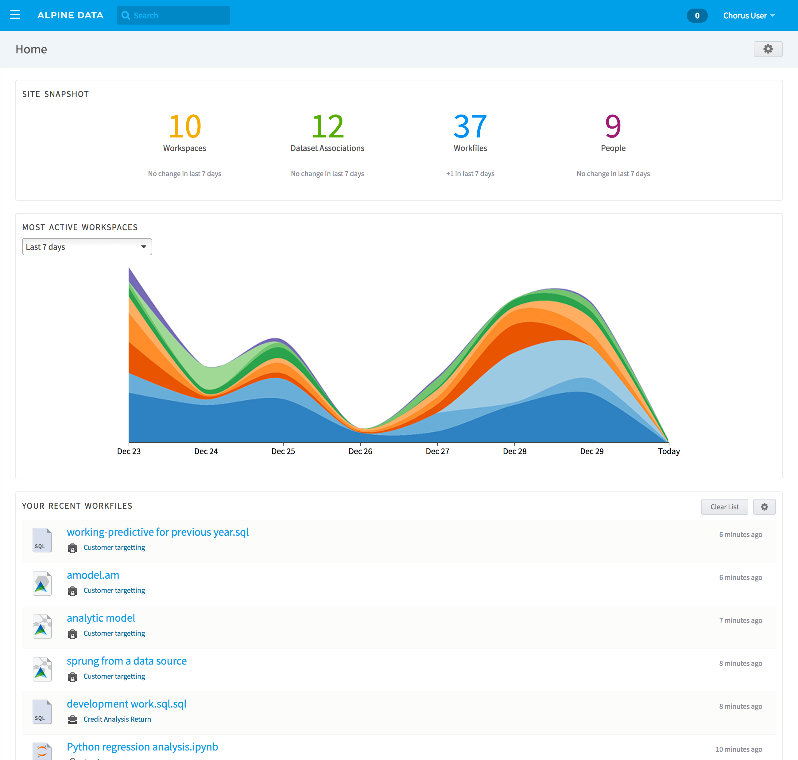
The New Page
The new page was designed as a modular arrangement of information with a single column for simplicity (it would be easier to add additional layouts in later iterations). Customization then would allow the user to change what appears on the page.
Customization
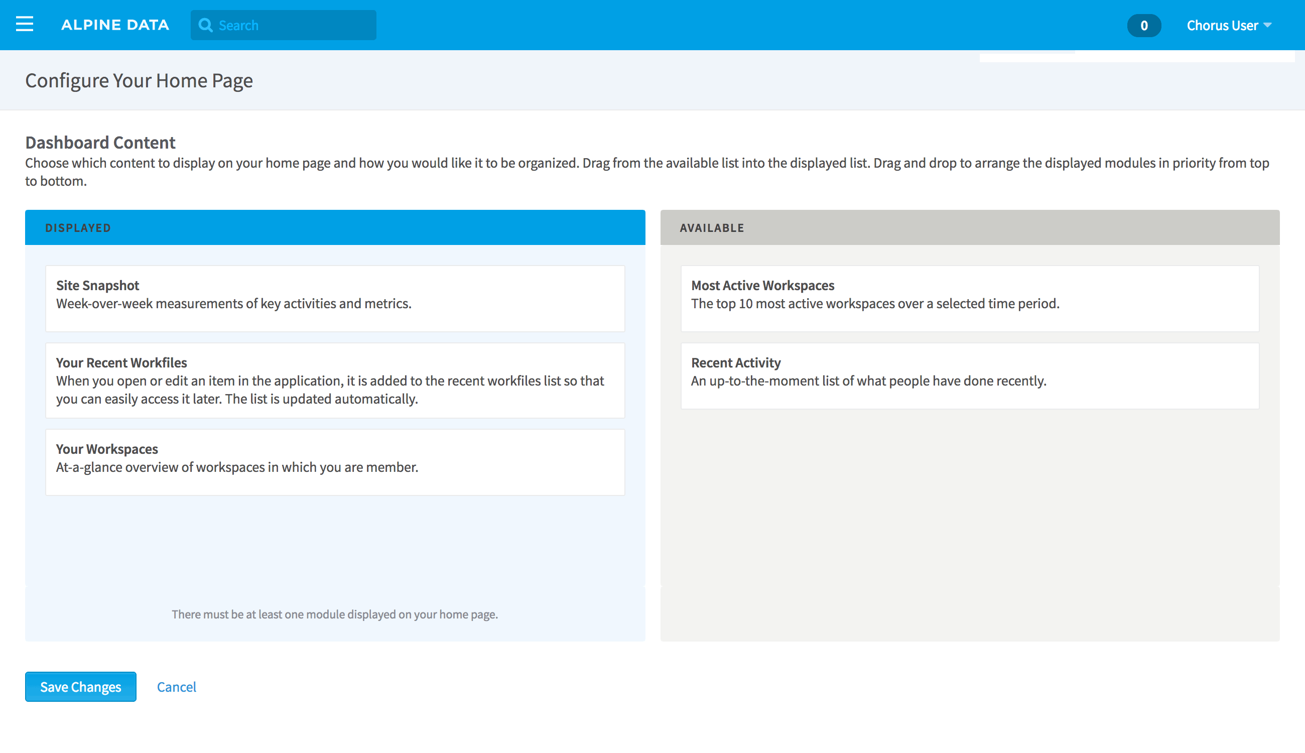
The first feature in Alpine Chorus to allow the user to configure their own experience, home page customization was designed to be straightforward and uncomplicated.
The default view of the dashboard consisted of five of the initial widgets, so that a new user would not have an empty home page when they logged in, and to give a starting point for changing the page to suit their needs.
When the customization action is invoked (via the glyph in the top right), two groups are presented: widgets that are currently displayed on the page, and widgets that are available to add to the page (i.e. are therefore not currently being displayed). Each widget is shown symbolically (and rectangularly) in a diagrammatic version of the dashboard page itself, creating a clear correspondence between the configuration view and how the actual dashboard page will be composed.
The dashboard owner can drag any widget representation from one group to the other. Reorganization is possible by the same method: grab a widget in the “Displayed” group, and move it up or down to the desired position.
The Widgets
A modular page needs modules. These are the "widgets, each one displaying specific information and content. Five widgets were initially designed and shipped with the (first) dashboard release.
These first content modules were either tools personalized for the specific user, or “Signs of Life” measurements of project and work activity across the entire application.
- Your Workspaces
- Your Recent Workfiles
- Site Snapshot
- Most Active Workspaces
- Recent Social Activity

- 1
- 2
- 3
- 4
- 5
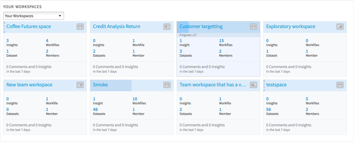
Your Workspaces
Overview of workspaces you are connected to. By default, “Your Workspaces” are displayed, and the ad-hoc filter can select between three views:
- All Workspaces
- Most Active Workspaces
- Your Workspaces
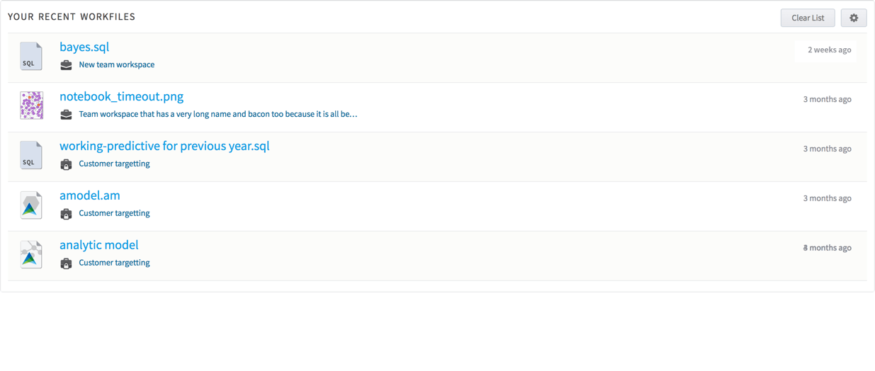
Your Recent Workfiles
An easy-to-access list of the files you were most recently working on.
Site Snapshot
Metrics for projects and collaborative work activity. This widget is the most straightforward instance of “Signs of Life” measurements.
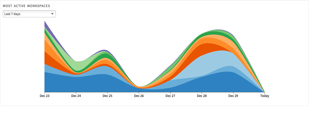
Most Active Workspaces
Ranking of collaboration and activity in projects (aggregate). The ranking is calculated by using a simple measurement of actions that happen within workspaces.
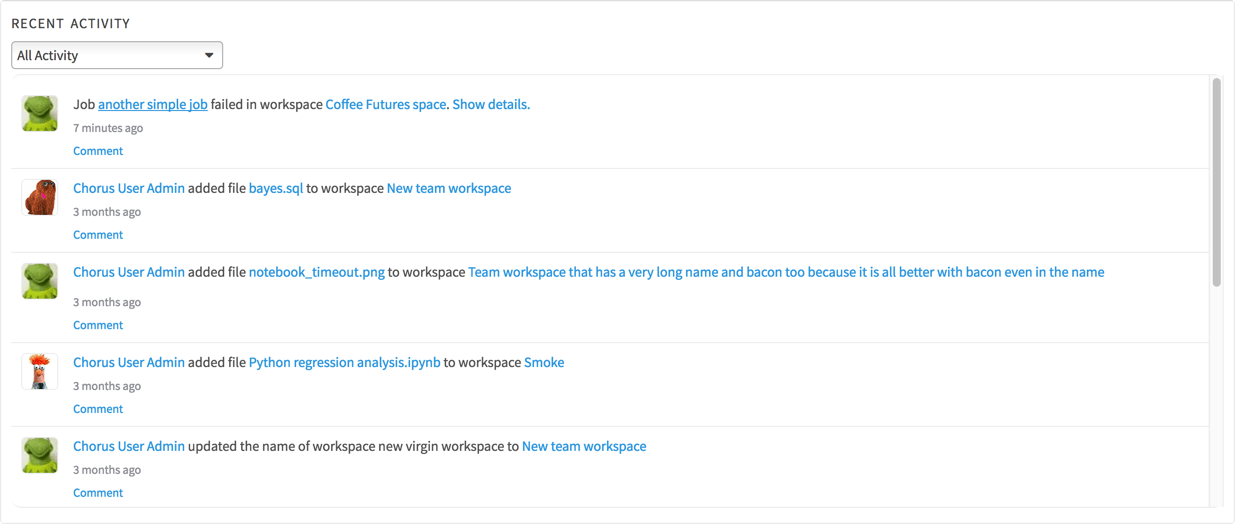
Recent Social Activity
A feed of comments and discussions pertaining to projects you are connected to.
Once and Future Widgets
Because the dashboard system was designed to be flexible and to grow, the infrastructure was in place to build and add new widgets in an ongoing manner.
A backlog of potential widgets was populated initially with ideas from the initial product ideation sessions and added to when a new idea presented itself, such as when watching users at work in the application. Some of the future possibilities included:
- A configurable collection of user profiles that you are connected to (e.g. team members)
- Project status summaries
- Your analytic jobs and their status
- Pinnable workspaces, so that you can concentrate on specific projects
- Most active people
- Intrinsic help and product tips
Subsequent product changes also spawned new widgets that integrated the new features into the dashboard (see: Touchpoints).


Designing an Extensible System for the Future
The personal dashboard page was designed as a very specific page in Alpine Chorus. It was also conceived and designed as the basis of a sustainable system for application growth, where the home page is only the first instance.
At the application architecture level, the home page established a model and the infrastructure for other locations in the application to evolve from static pages to dynamic presentations with an improved user experience. On any individual page, the built-in flexibility enables configurations that can be determined automatically by role, location, and other contextual parameters. Or, the configurability can be turned off to use a predefined layout and set of modules.
Within the page, the modularity supports adding new widgets that are relevant to specific contexts (and limiting them to those contexts), while opening expansion to community invention and contribution.
Some of the high-value locations in the application targetted for transformation:
- Workspace home page
Provides a summary of the current progress and the project work within the workspace.
- User profile page
Provides a summary view of what the person has been working on, projects they are involved with, and the data they use.
- Team home page
Provides an overview similar to an individual user’s profile page, but for project teams.
How to Evaluate the Potential for a Modular Page?
Whether or not a view would be a good candidate for conversion to a configurable, modular format – in Chorus, and for enterprise applications in general – can be assessed with a few qualifying questions:
- Is the page located at a branch in the user’s path, and is it a type of "landing page"?
- Does the page serve as a nexus for multiple sets of aggregated information, especially information that is not easily available elsewhere in the application?
- Do users with different roles frequently visit the page?
Defining what should be on a transformed page is informed by looking at the needs of the users crossing paths with the page.