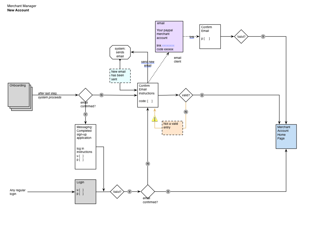
User experience and interaction design for an evolution of the business-focused Merchant Manager platform.
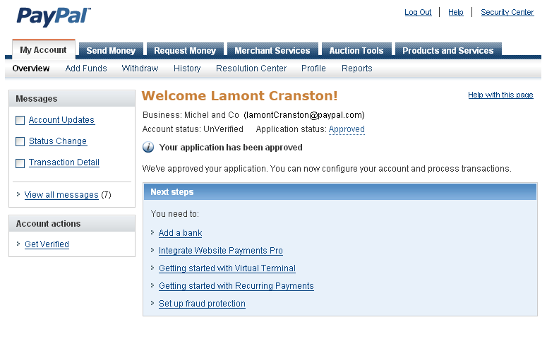
Starting with the account overview, the system was redesigned to provide a new, improved user experience founded on the principle of giving the merchants the information they want and need to run their account.
Project Background
PayPal embarked on a long-term project to build a new unifed platform for merchant customers, and the first stage of this concentrated on small and medium businesses (average payment volume between USD 250,000 and one million).
Project Objectives
The purpose of this project was to create a coherent and consistent product platform for PayPal merchants, maintaining the core account features while adding user experience improvements.
Development Process
The Merchant Manager redesign was also used as a pilot of Agile Scrum for product development at Paypal, where waterfall had hitherto been the method of record. This experiment exposed both challenges and opportunities over the course of the project’s existence, from learning curve friction to the difficulty in advocating for user experience in the middle of an engineering-centric philosophy.
Design Agility
A product design experiment that was able to germinate in such an environment was the introduction of “live” wireframes to the team. Built in parallel with the (required) document-based wireframes (pdf), the HTML wireframes were iterated weekly, version-controlled, and published to a location accessible to everyone. They opened new avenues of discussion within the teams and narrowed the chasm between the document specifications and the final results. Also, without these pages, the in-progress user testing would not have been possible.
Project Roles
As lead product designer, I led the overall UX design, coordinated concurrent design streams, and was directly responsible for the interaction design deliverables. The wider UX team included user researchers, visual designers (responsible for the look-and-feel coordination with the Paypal style standards), and content writers.
Designing for the Merchant Business
From extensive user research interviews, lab usability tests, and ethnographic studies, a picture emerged of a user base that was invested in using the platform but dissatisfied with the current experience.
The design work distilled these learnings down to common objectives and principles that would be applicable to the entire platform. The result was expressed as a simple guideline:
Focus on Communicating to the Business Owner:
Design Requirements
After the functional requirements for the project were finalized, user-centered requirements were composed:
- Positive first impression of the application
- Welcome greeting on login
- Deliver the PayPal.com experience, incorporating the user needs and tasks
- Core PayPal business account features must remain available (account balance, send money, etc.)
Merchant Manager
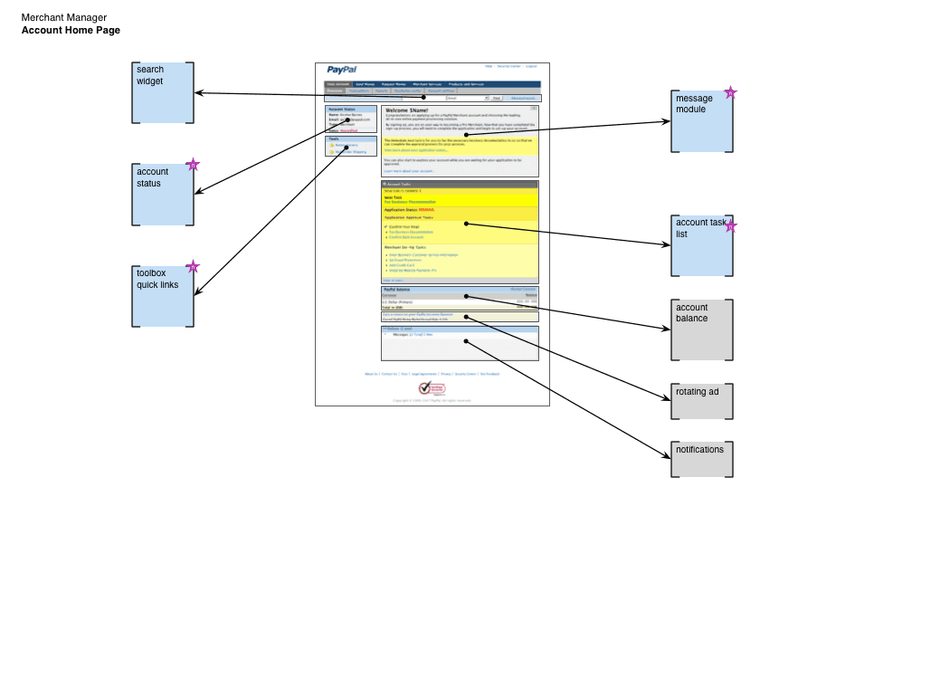
Because of the complexity and complications in the existing Paypal environment, the pragmatic and effective solution for the account overview page was to break it down into the constituent modules and map out a multi-release sequence for a complete upgrade. In the short-term, the page would be a hybrid of both old and new elements, including components like the account balance modules which was standardized across all of PayPal.
Account Overview
User research had uncovered two things about the existing account overview page:
- Users wanted easier access to common merchant tools.
- The existing set-up steps were valuable, but not usefully presented or easy to understand.
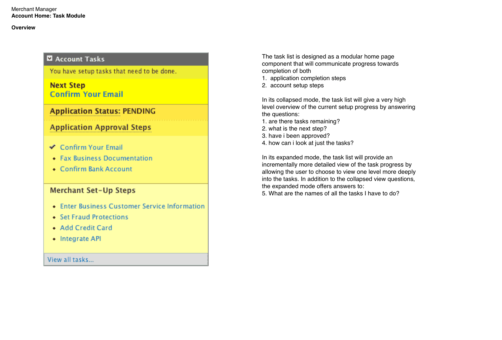
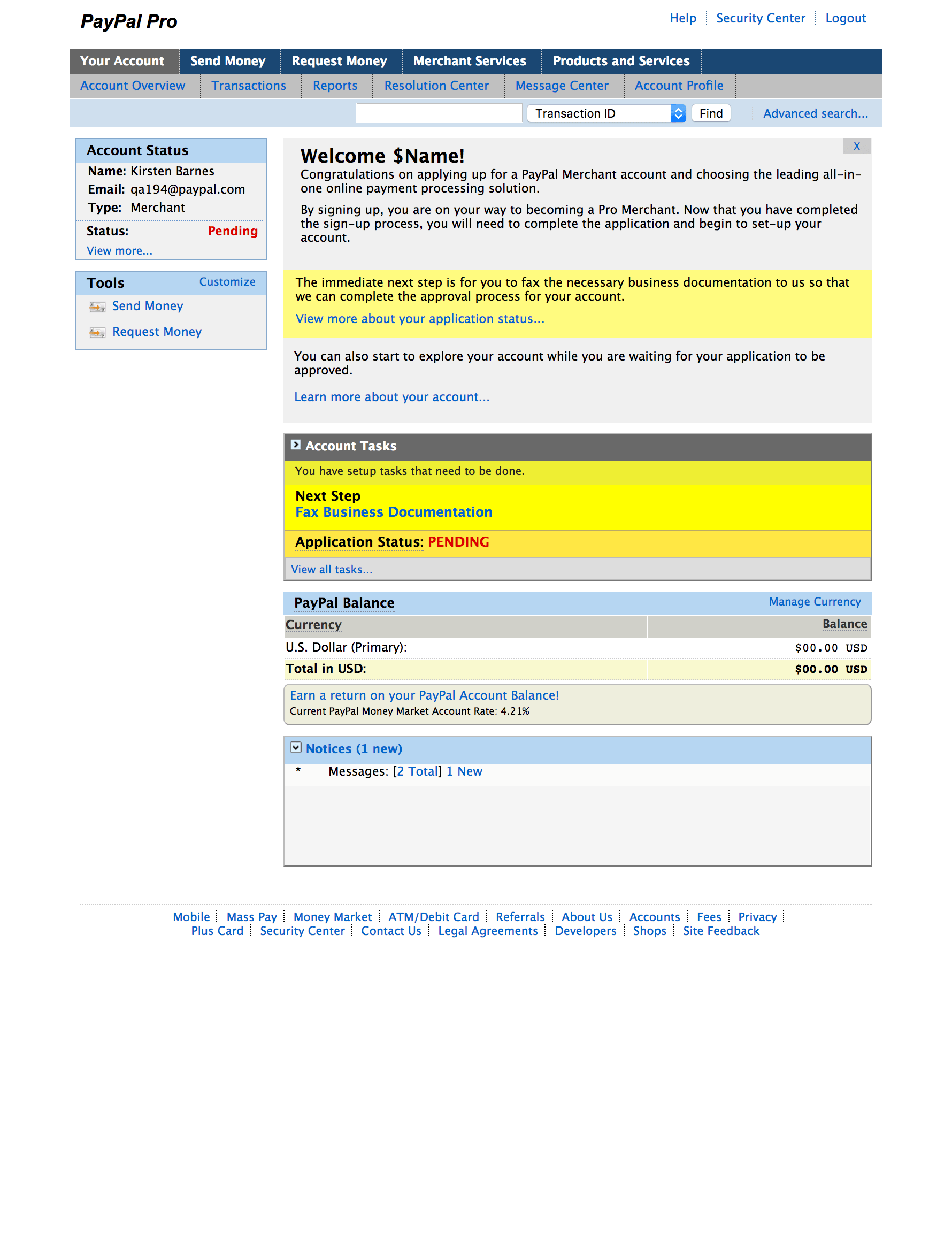
In designing a new solution to address the user feedback and deliver a better experience, a modular approach was developed. As a module, the first dramatic addition to the merchant’s home page was the new task list.
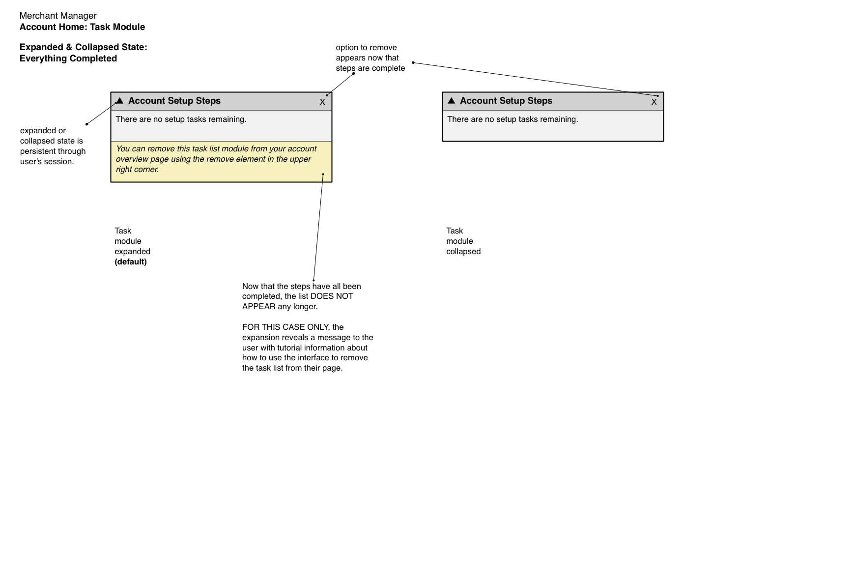
The Account Tasks Module
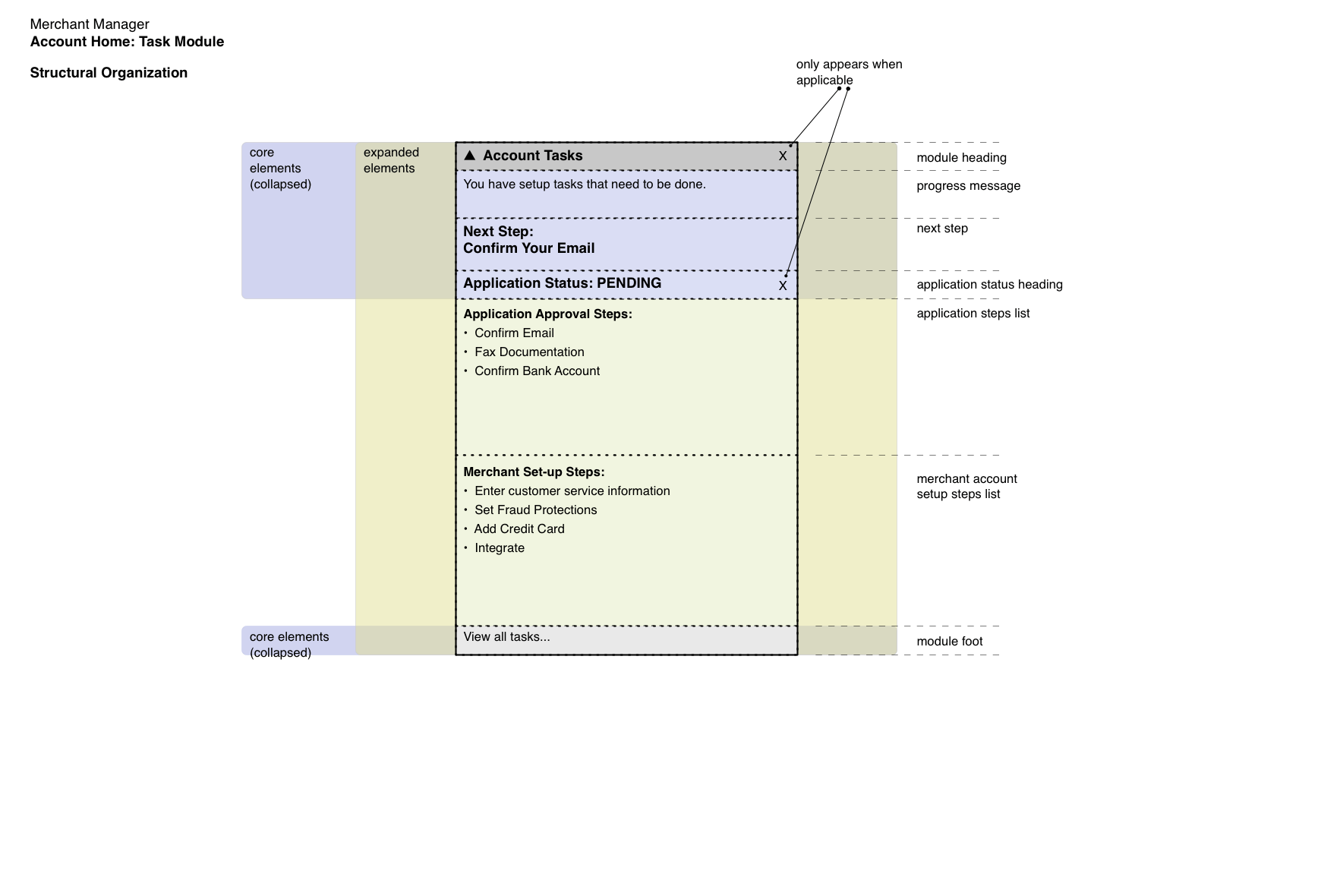
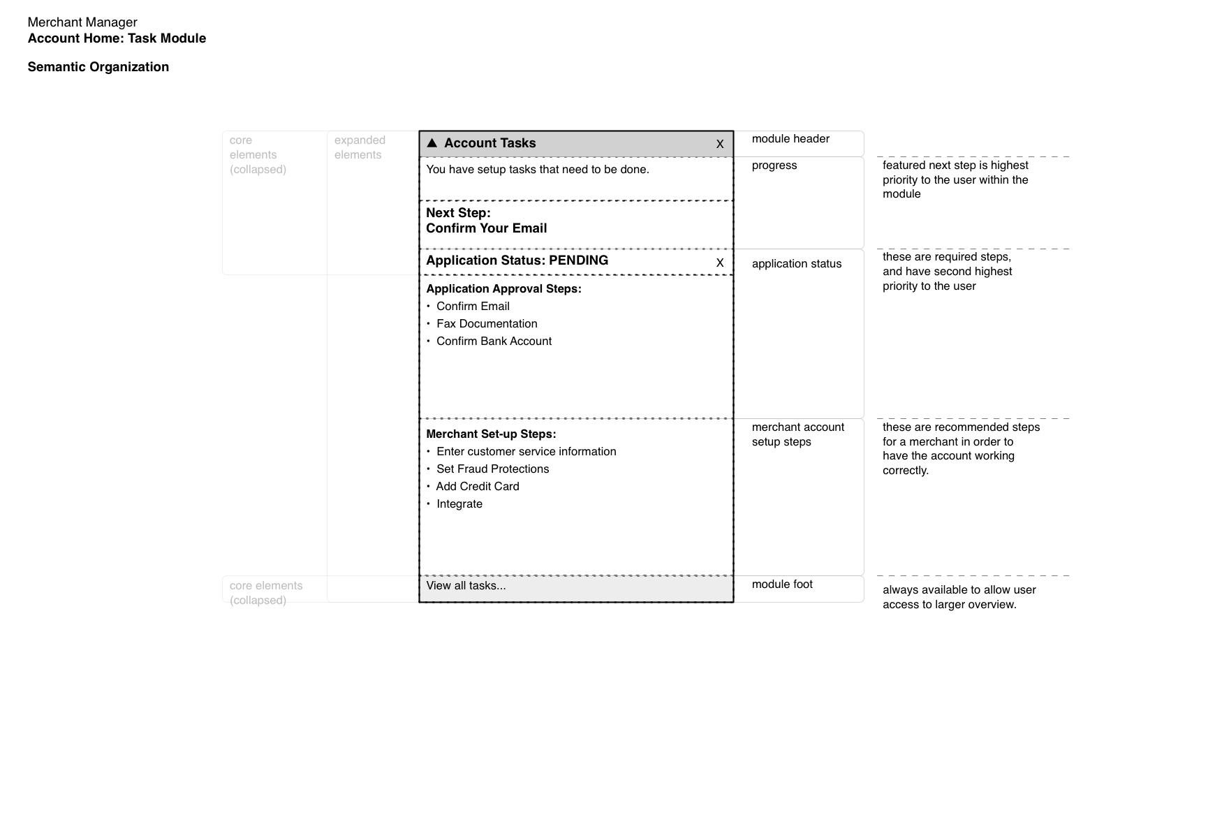
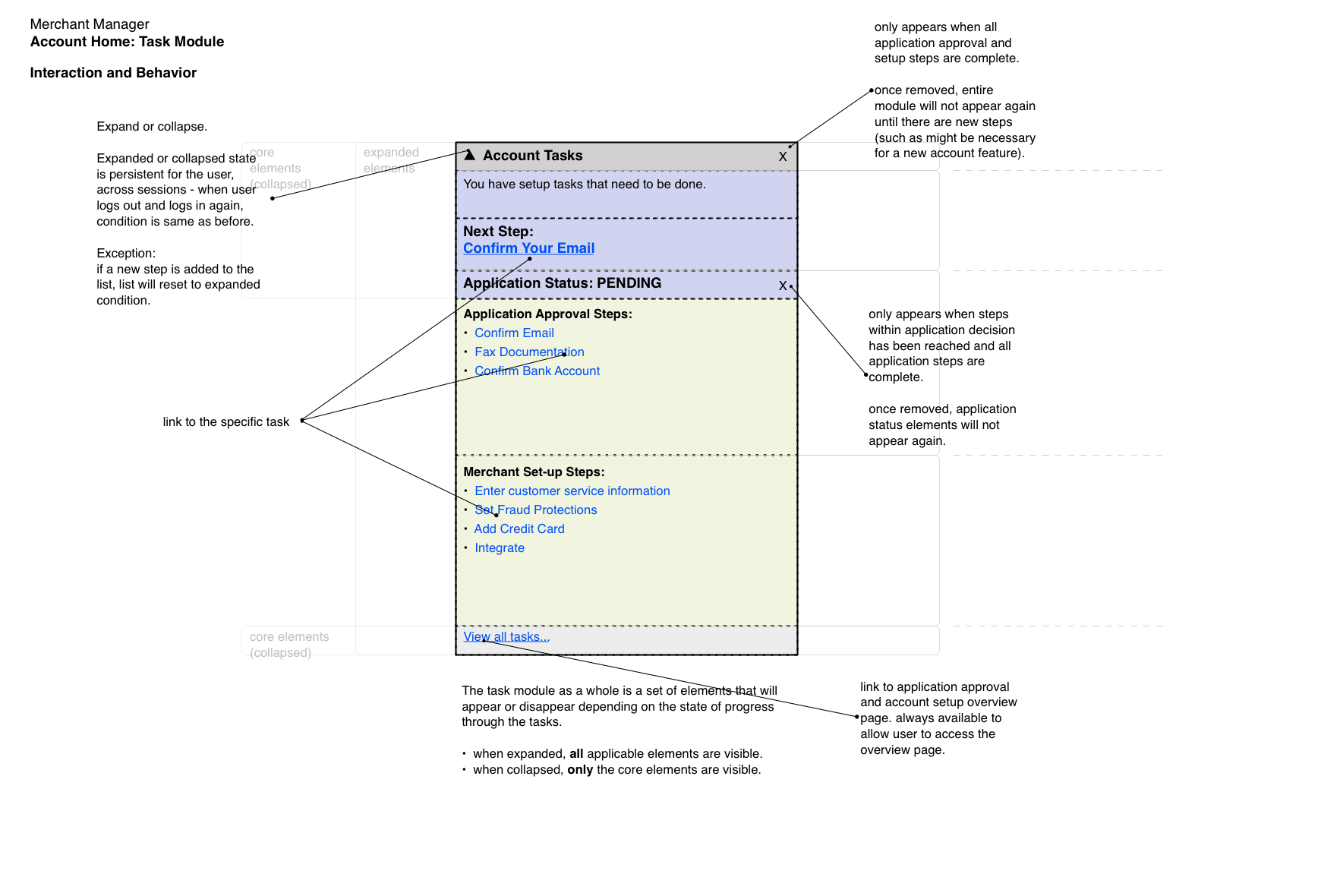
Merchant accounts are subject to a series of account setup tasks, both required and recommended. Required steps are mandatory in order to have the account approved by PayPal; an account was not fully enabled and could not accept payments until completing a series of regulatory and authentication reviews. Recommended steps are voluntary and encouraged tasks that benefit the merchant.
After exploring a few options based on “account completeness” patterns, the design discarded the typical progress bars and visual sequence indicators because they were not adequate for the conditions.
The crucial problem was that account setup is not a single linear progression, but multiple forking paths and conditionals that could be invoked depending on the results of the current step. All of the steps were defined, but they existed in a network relationship. This meant that the necessary sequence could not be determined at the beginning of the process.
In addition, the usual number of steps was seven, with the possibility of eight or nine. This was determined to be too many for any of the more typical graphical ideas.
Instead, a more complex, language-based, structured system was invented.
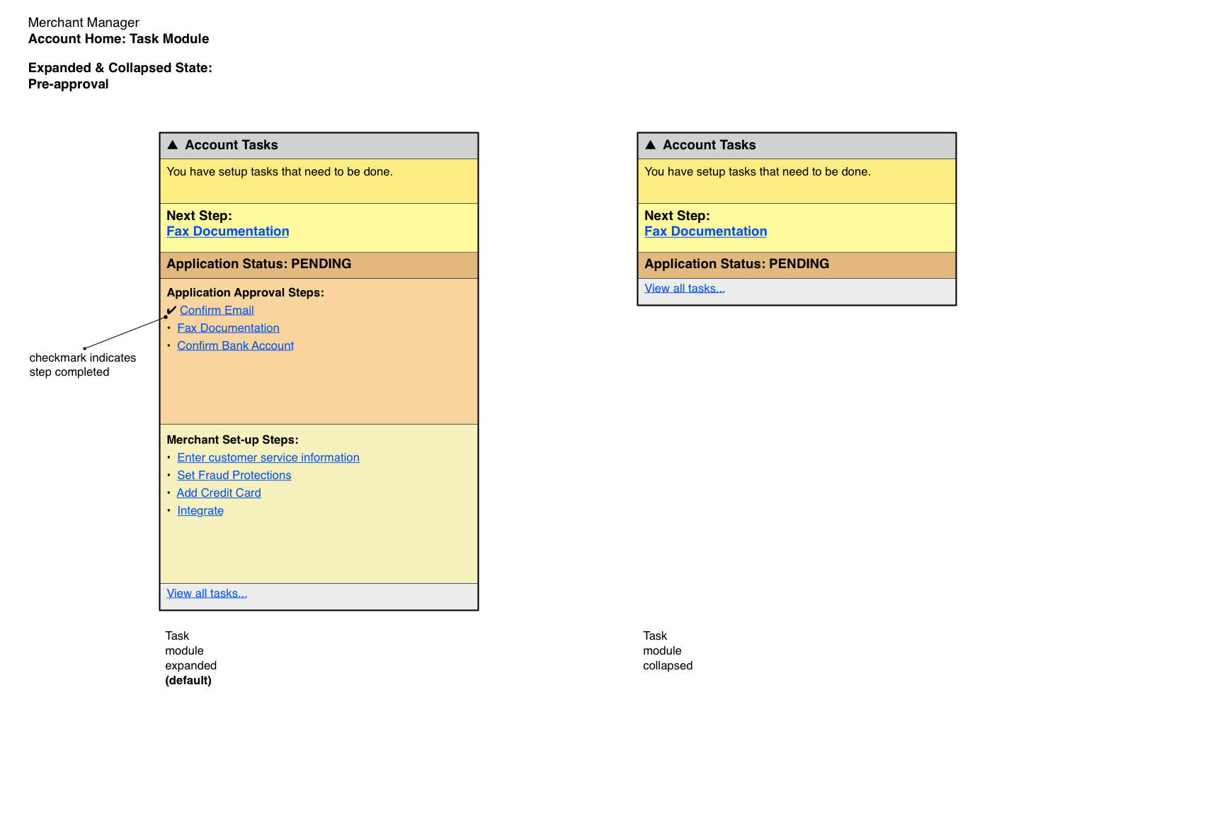
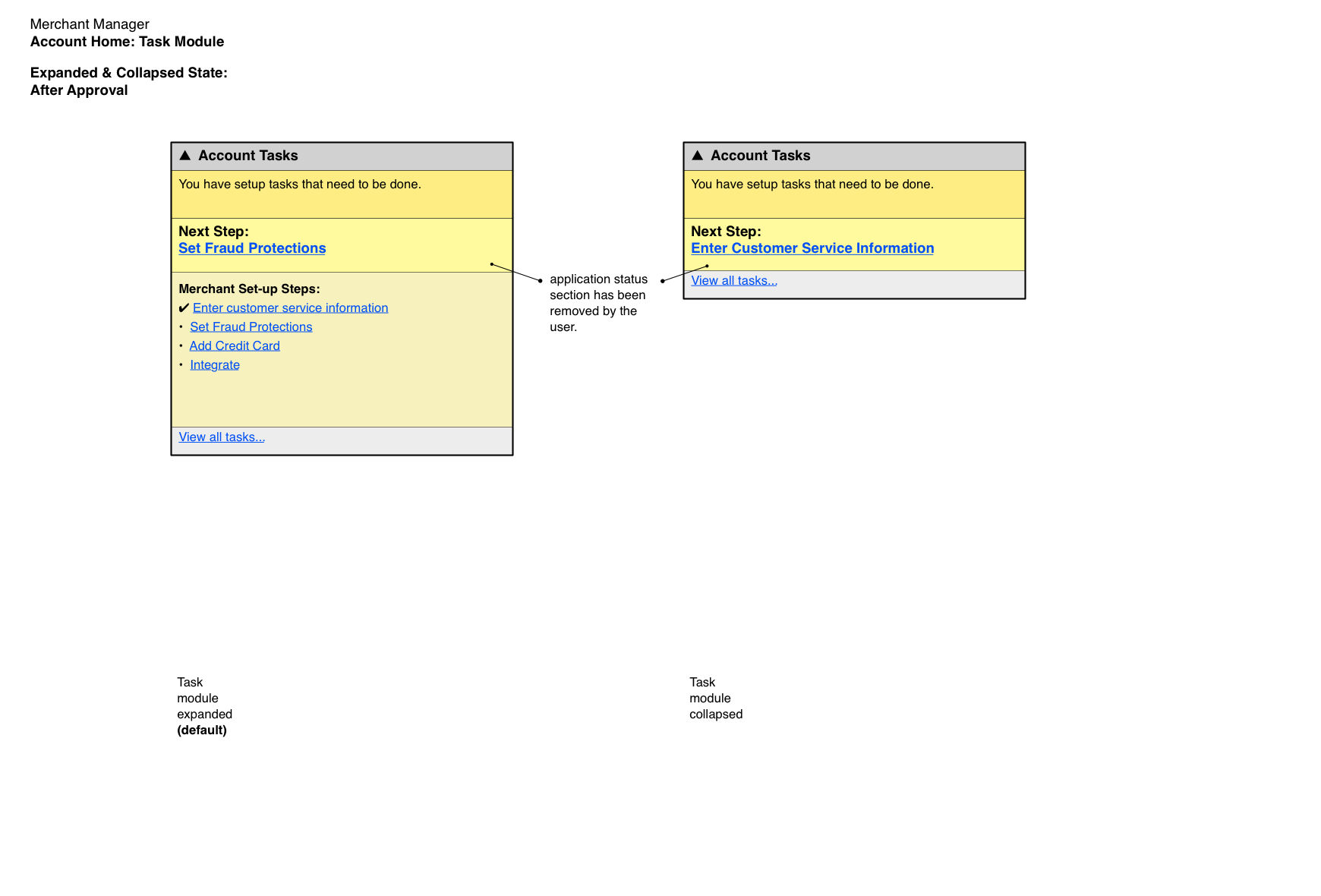
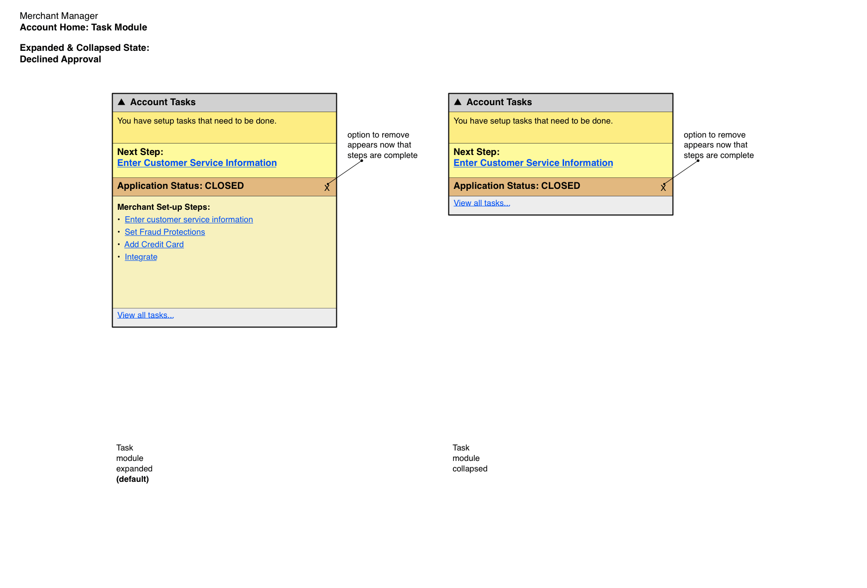
Characteristic of a dashboard-type page (which the account overview is), the module simplifies the overall complexity for the user and displays only the actionable current and immediate next steps. As the merchant works through a task, the display updates to reflect real-time progress. Expand and collapse capabilities allow the user to inquire more deeply into the information shown, along with links to full assistance content.
As further service to the platform, the module was formulated so that it could serve as a universal module within the system and be used for later sequenced tasks, such as when the merchant subscribes to the Virtual Terminal service, which had its own configuration requirements.
The Message Module
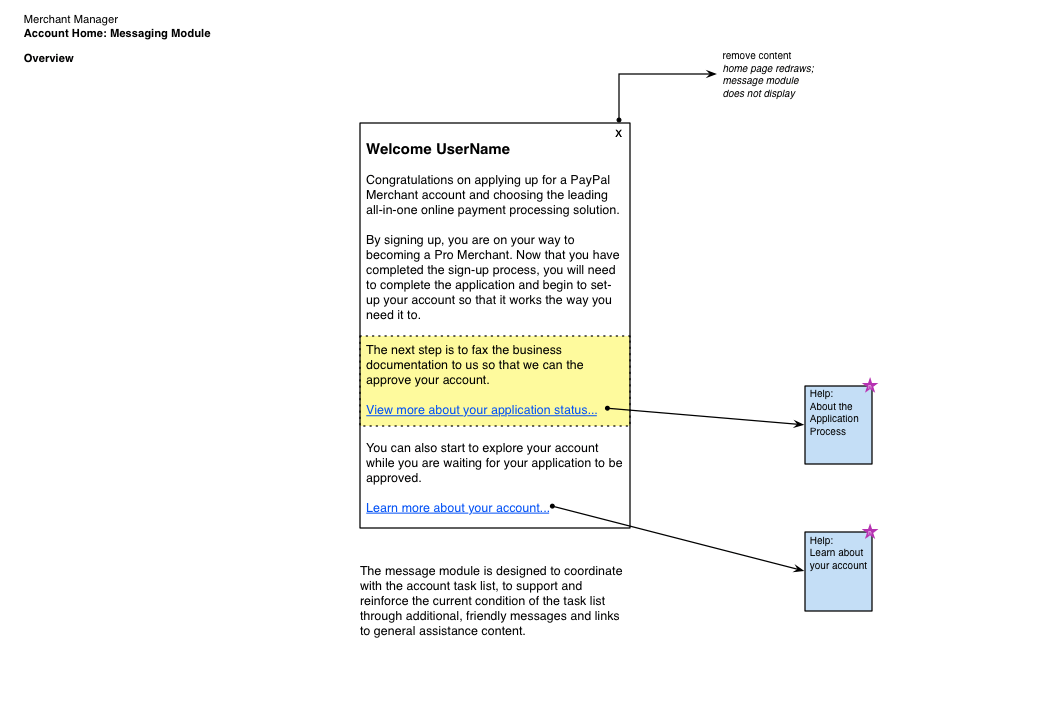
The next piece of the home page is a module for messages and notifications to the user.
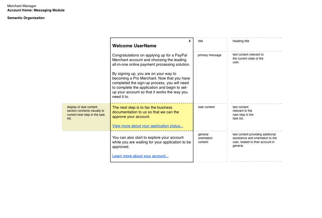
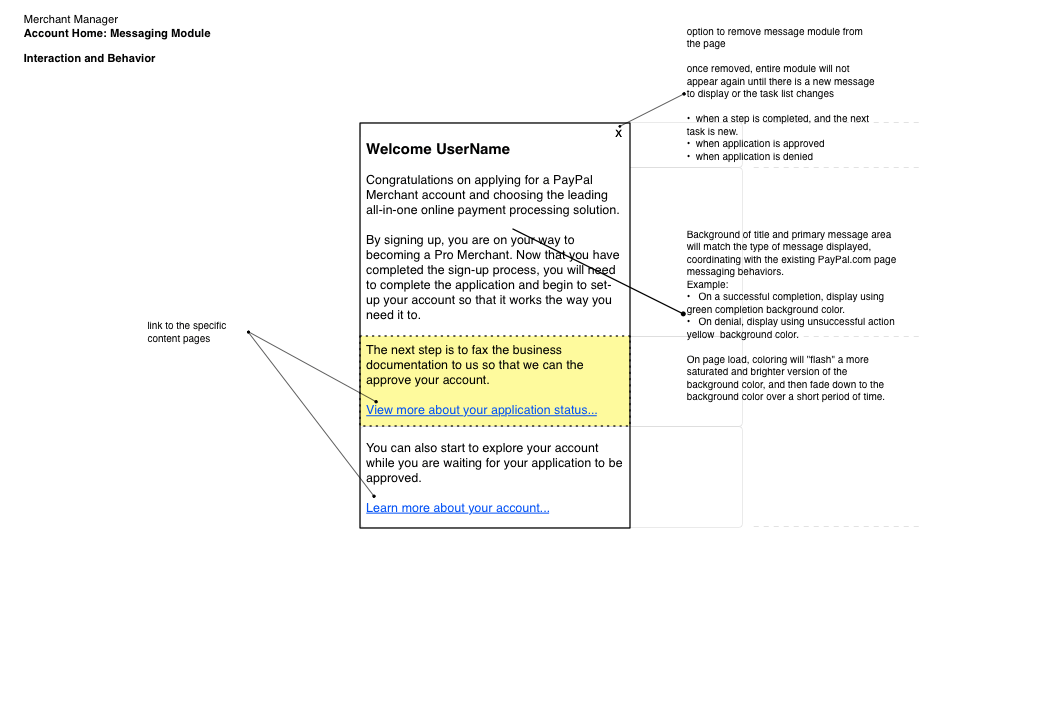
Delivering a friendly welcome message on first login, the Message module had a simple structure, whereby additional assistance and personalized directives that spoke directly to the user would be delivered on the landing page. Coordinated with the Task module steps, the Message module supports communication and orientation throughout all stages of critical setup steps.
The Toolbox Module
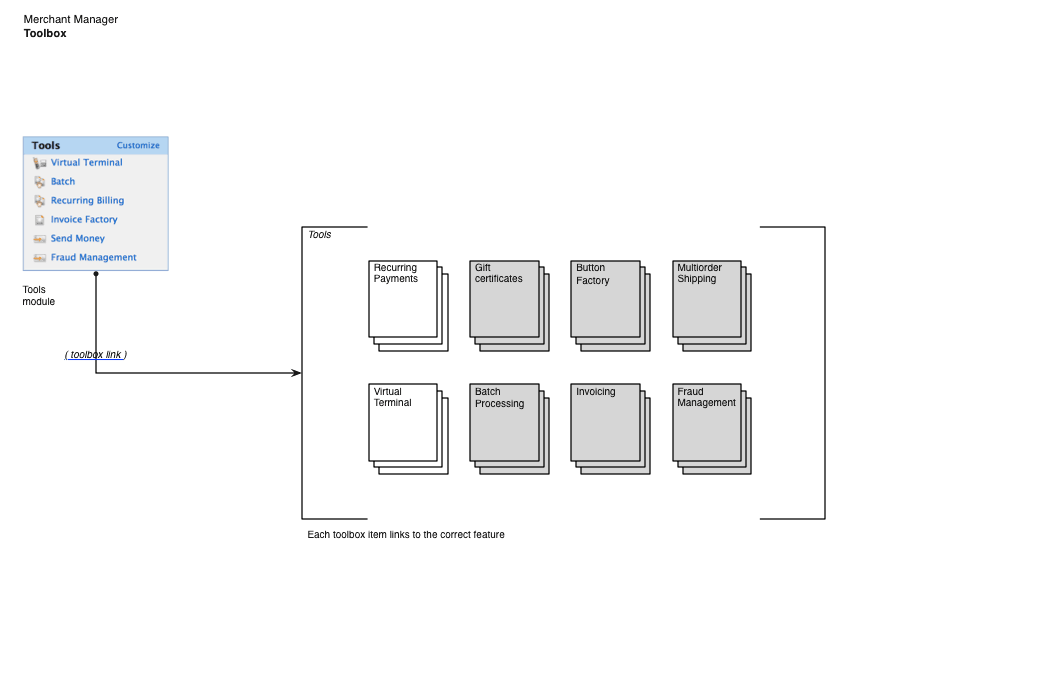
The Toolbox module was built to address the feedback about wanting easier access to common tools. A module on the home page, it provides direct access to the Paypal services and products that are enabled for the merchant account.
The Toolbox introduced the first use of user customization in the application, allowing the individual merchant to configure the module to their needs by setting which of the services would display.
Putting It All Together
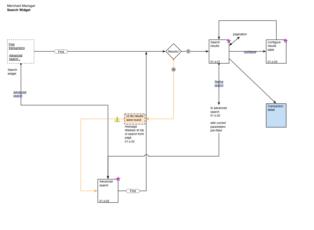
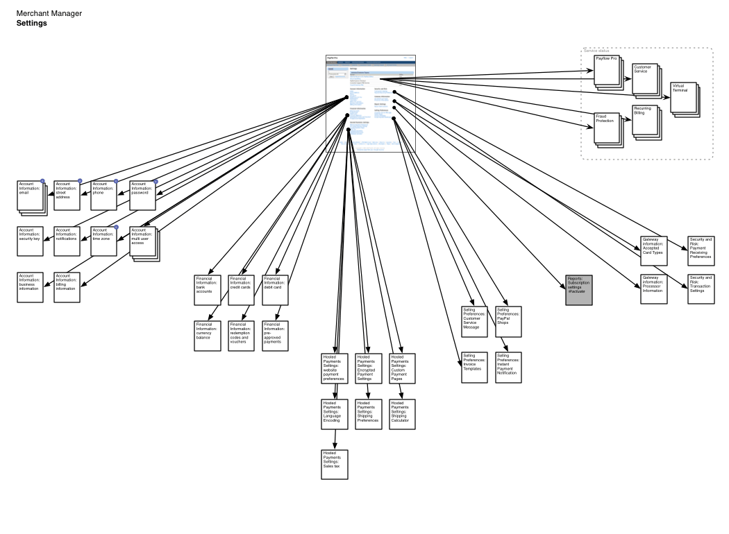
Working wireframe prototypes were built to function as behavioral specifications for the interactions and content to the wider team.
A Suite of Merchant Products
The broad Merchant Manager platform includes a suite of additional services that are available on a subscription basis. Selected products in this collection were also redesigned.
- Virtual Terminal
- Recurring Payments
- Support Center
Virtual Terminal
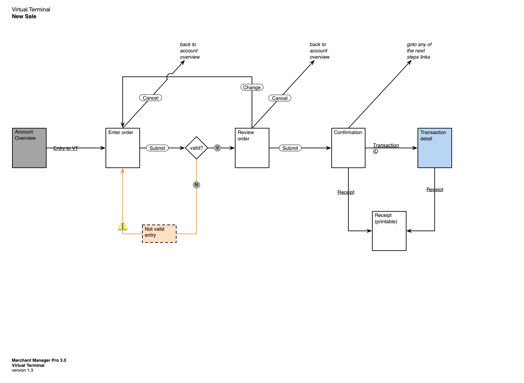
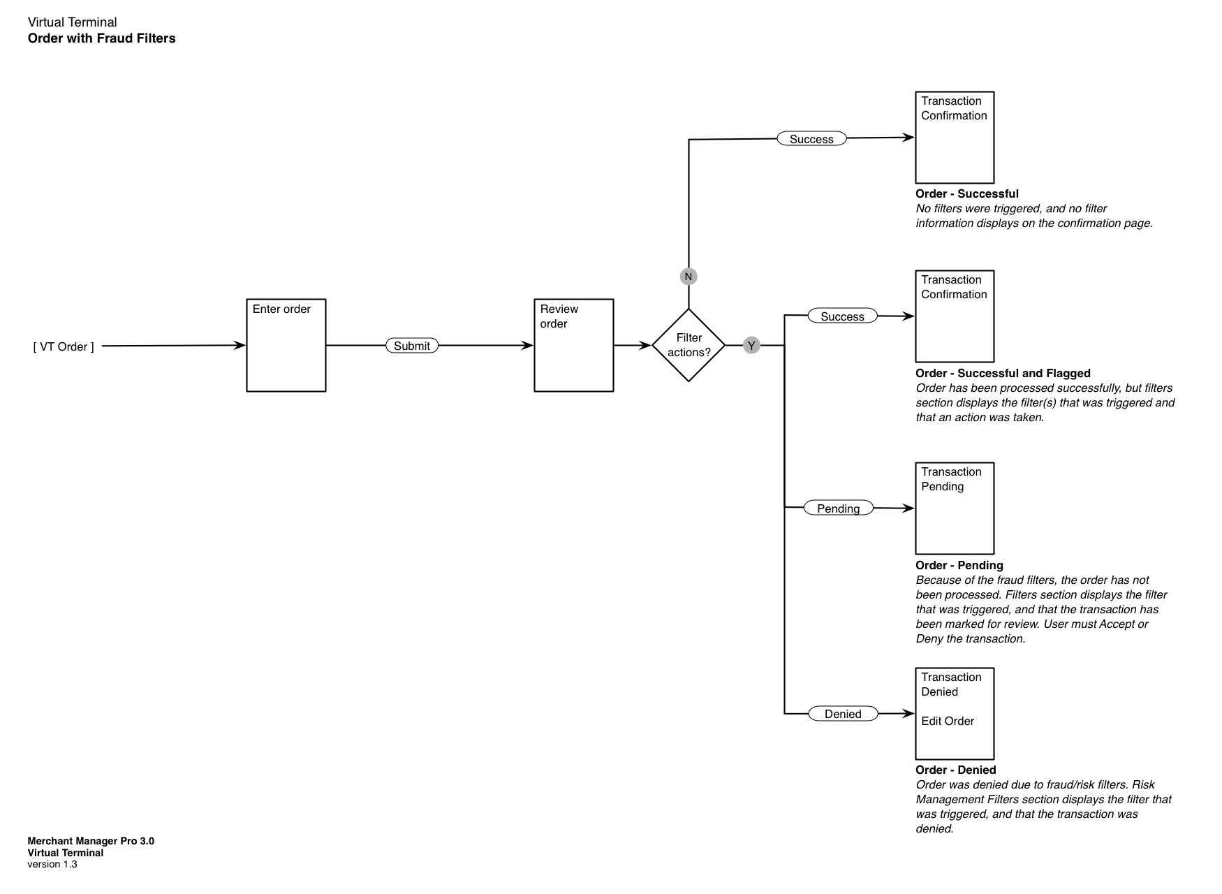
Virtual Terminal is a web application for processing credit card orders received by phone, mail, or fax. It did not change extensively; the experience was refreshed and updated to maintain general consistency with the new merchant front-page, form usability was improved, and new fraud management features were designed.
Recurring Payments
Recurring Payments is a service businesses use to create scheduled, repeated charges to customers, such as a monthly subscription or an annual fee.
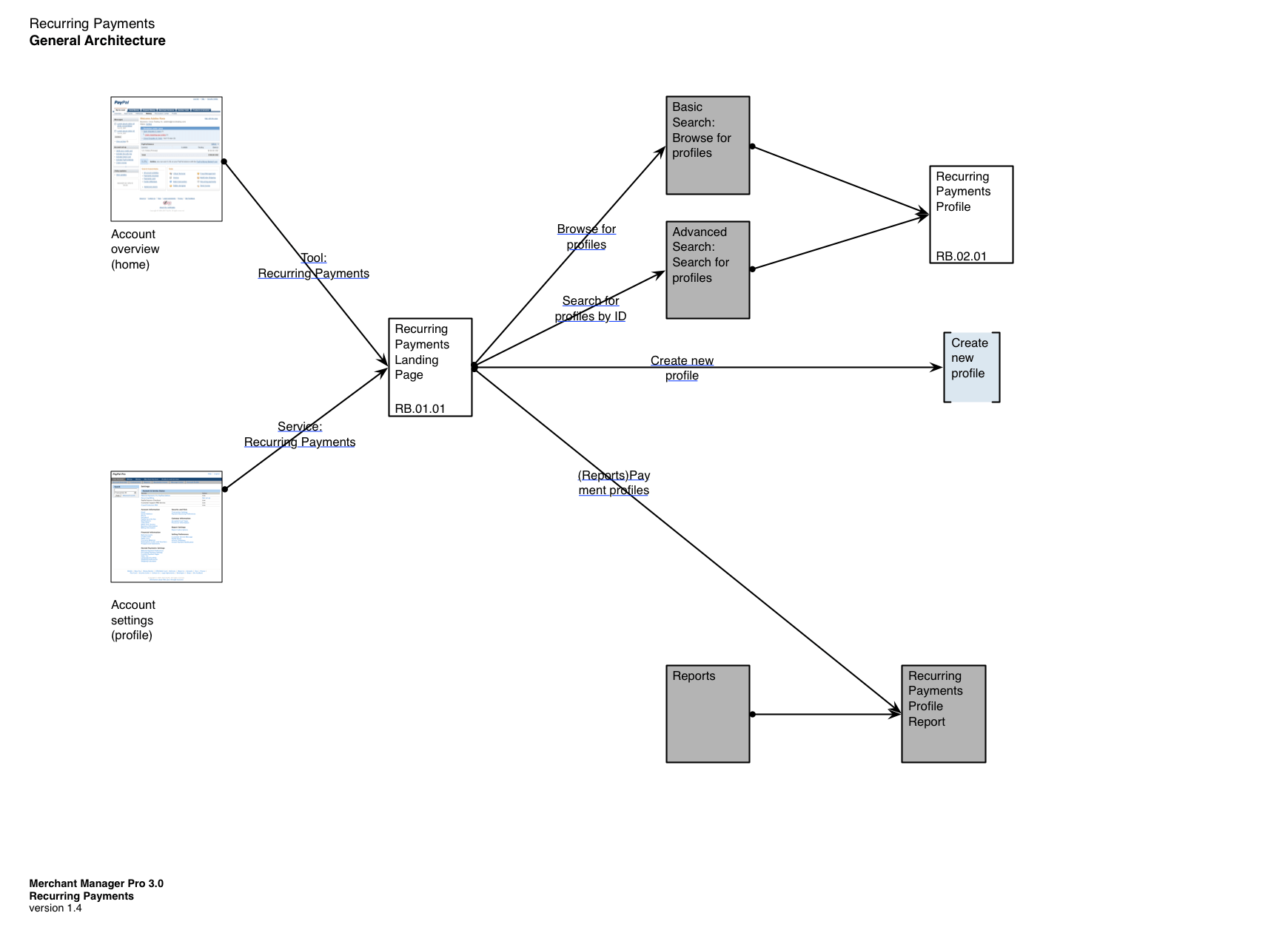
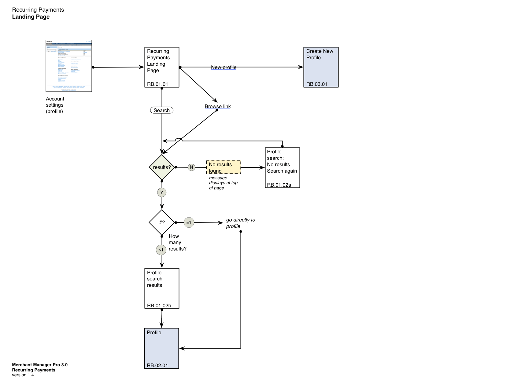
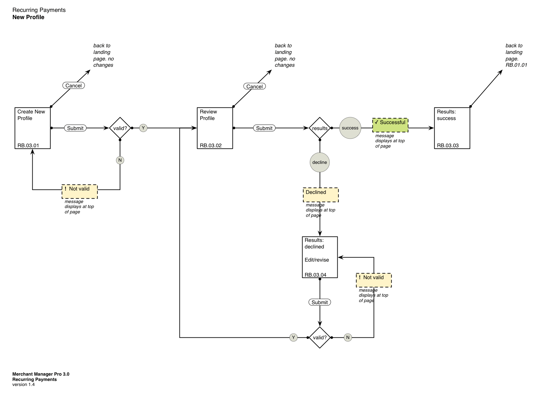
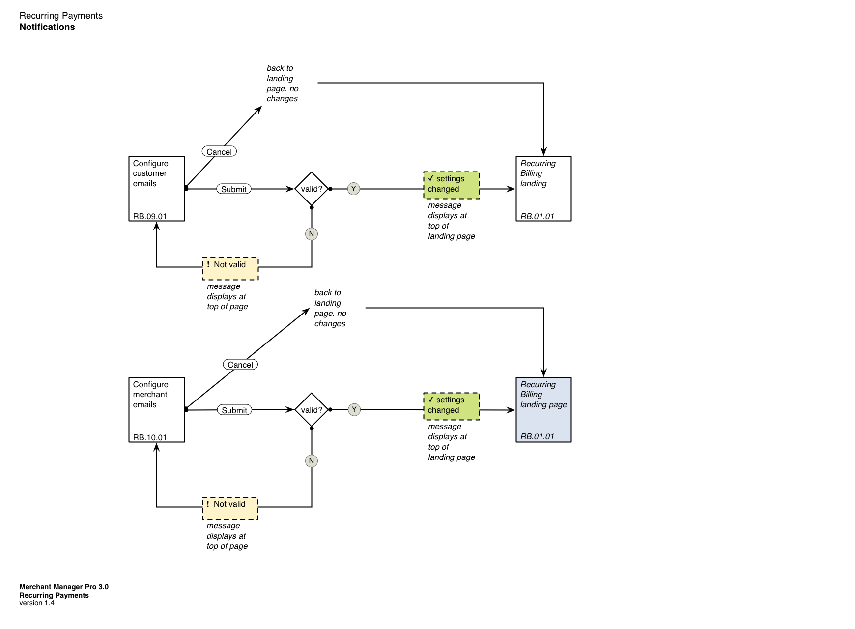
The recurring payments tool was integrated into the new design, with new behaviors designed for customer profiles management and payment notifications.
Support Center
The support center created an entirely new self-service support gateway for Merchants using PayPal and integrating PayPal. The design goal was to unite together a number of disparate and uneven support resources so that a person could find support information more easily and consistently.
The business goal of this effort was to reduce support costs for the business unit: product-related questions resulted in at least 3,000 contacts a month.
For the user, direct feedback and research demonstrated that a usable support center would increase productivity and satisfaction.
Design Approach
Two concepts formed the basis of the new design:
- Personalization
Distinguish between products and services the user has and does not have.
- Progressive disclosure
Display minimal information by default. Show more information only when the user requests it.
Design Solution
The new product support portal design took the form of a comprehensive, dashboard-like view that displayed all products and services available to the customer, clustered into two groups:
- Products that are enabled for this account (above).
- Other appropriate products that Paypal offers (below).
For enabled products, each product module displayed the current service status, along with most frequently accessed questions or support information about the product. Giving attention to a product (hovering) would expand the module, revealing a complete outline of information about using that service.
Products that the current merchant did not subscribe to were presented differently. Since the main user task for these services was research, an introductory description was the main content. Expansion revealed resources meant to help learn and understand what the product was and what could be done with it, along with a call-to-action to purchase or upgrade.
Individual Product Pages
A landing page was also designed for each product as a template, and the two different cases (has product/does not have product) were carried through to these pages.
Similar in spirit to the small modules on the overview page, but with more detail about the product and much more content, the landing page provides access to all of the support resources, and the structure of the page changes to reflect the different user goals and needs.
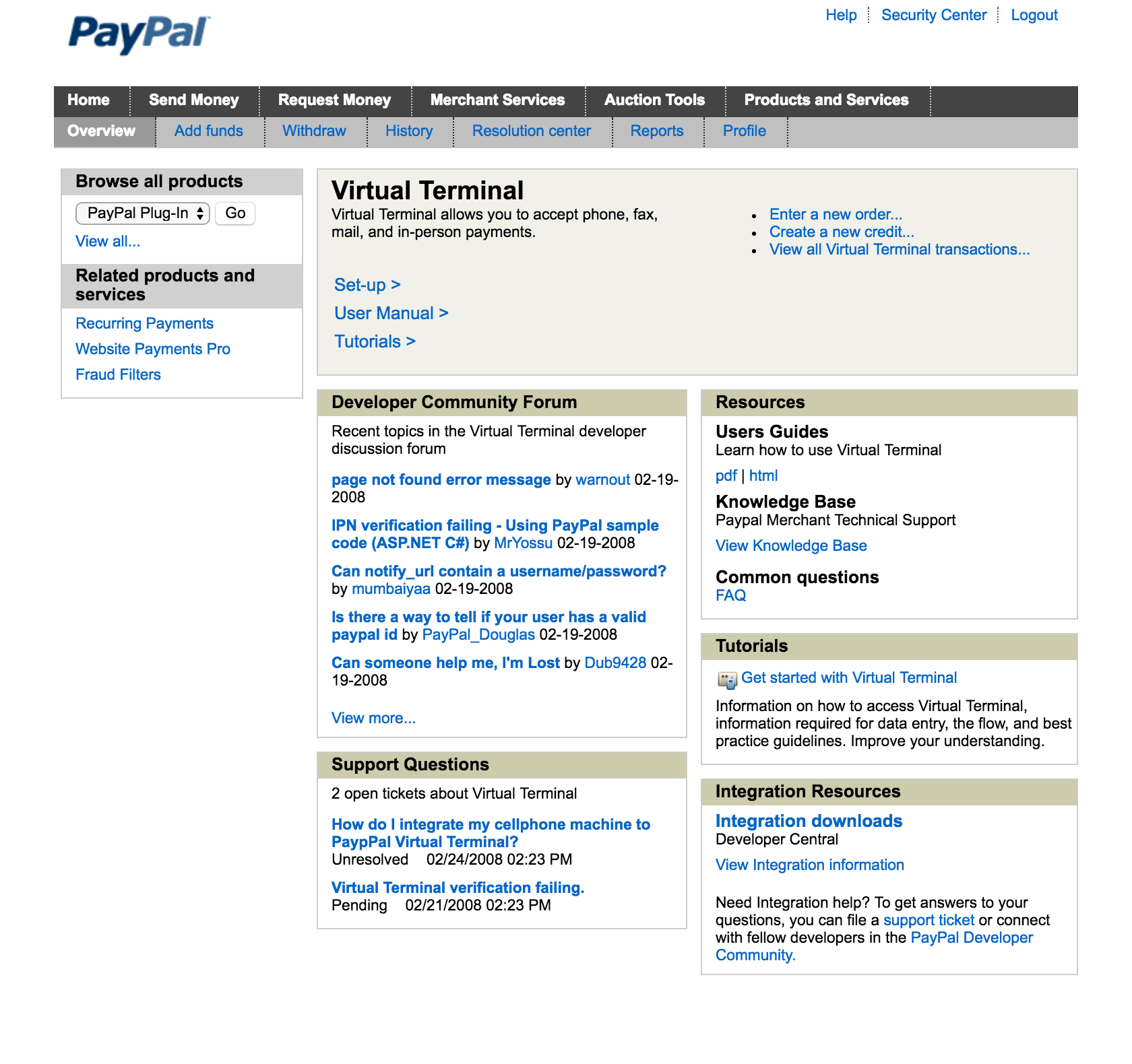
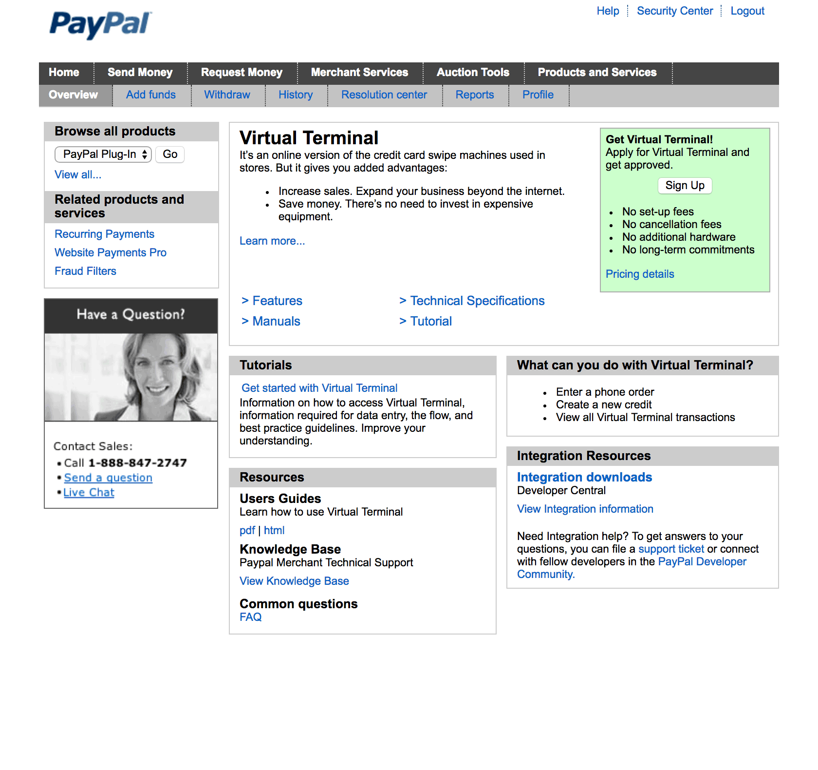
Design wireframes.
Support Center Feedback
The first release of the new support center overview received positive response from merchants (measured by user testing), and the targeted customer service call volume declined (measured after the new design had been live for a quarter). However, there were two notable problems that were exposed:
First, while the grouping of services was rated as useful, merchants were quickly inspired to ask for a more sophisticated guided process that would ask them what they would like to accomplish and would recommend specific new services for their needs. Automatic recommendations based on their activity and existing subscriptions were also requested.
Second, easier access to the help content and marketing pages brought to light that those destination pages had not been redesigned in coordination, causing merchants to feel like the implementation was incomplete and unfinished, which in turn led to reduced trust.
