Product conception, product vision, interaction design, and visual design for a new enterprise application to build relationships between IT metrics and Business performance.
- Translate IT performance into the language of the business
- Enable communication and cooperation between IT and Business
Project Background
For the new business year, the Service Assurance business group had a strategic imperative to build a new product and fill a gap in the existing product line, focusing on the business executive.
Product Charter
The charter for this new initiative appeared straightforward:
Develop a new Service Assurance product for “Executives” that enables IT to communicate to the business, in the voice of the business, with real-time information and measurements.
With two additional requirements:
- Foster collaboration
- Mobile-first
Around this mandate, a cross-disciplinary project team was formed to define the new product. Discussions focused on markets and technology but stagnated in defining the product itself, particularly who the “executive” was and what an “executive metric” was.
These conditions provided the opportunity to turn it into a project driven by design: first by creating a product position and foundation of key concepts, then by vetting these ideas and getting the team on board, and finally by designing the product to life.
Project Results
The first internally grown mobile product within the company, CA Executive Insight was released as a marquee product announcement at that year's annual user conference, and was awarded CA's “most innovative product” in 2012. The system behind Executive Insight is patent-pending.
Project Roles
As product design lead and manager for the Service Assurance business group, I created the product concepts, vision, UX requirements, UX design, and worked closely with the product manager and product engineering team to bring the product to market.
After version 1.0 was released, I oversaw the UX direction as Product Design Director when the project transitioned to a new design team (consisting of John Bailey, UX product design manager; Nick Lala, product designer).
Defining the Real Problem
From discussions with existing enterprise customers and a broad range of inquiry, the exploratory project research did establish a few aspects of the new application. The executive user generally wanted visual charts and graphics in a dashboard format. Both a web and mobile component would be needed. Executive Insight should not be a general business intelligence solution.
Perhaps because technology itself was a more comfortable subject, the initial product definitions spoke of the application in terms of what the software would do (it will display dashboards) or in terms of the market opportunity (it’s great). They didn’t address the problem of what to actually display.
Applying design analysis and synthesis helped me understand that the real problem was not what was thought to be the problem.

Displaying information in a dashboard format was a problem that already had many known solutions. It needed to be built, but it did not need to be invented.
The real problem was defining what business metrics were. That did need to be invented.
The solutions to this challenge are two ideas that became the foundation of the entire design.
The Key Product Ideas
I defined The business layer model and the metric layer model in order to make more tangible two concepts that underlie the entire experience of Executive Insight. Together, they inform and enable the power of incremental metrics.
The Business Layers Model
Out of the design research emerged the character of the correct target user type — not the c-suite, as had been presupposed, but the business stakeholders responsible for the strategic performance of the business. Personas then were written to embody that group, with examples of what that user wanted to know. Besides being an invaluable help in reframing project conversation in general, these were crucial to resolving the question of just what an executive metric was.
Modeling the executive user illuminated that trying to find specific metrics applicable to all (a priori) could not be successful — different roles and different companies want different measurements. Also, crucially, it showed that some part of business metrics are going to be “external” to the IT environment, and that attempting to define them directly with the available resources was not even possible.
However, by understanding the user, it was possible to apprehend the type of metrics valuable to that user, leading to the first important concept for the project, the business layer model.
Strategic Measures
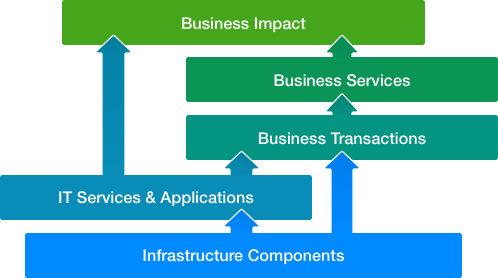
The business layer model organizes the different organizational tiers within a company, the types of questions that are asked at those layers, and the relationships between the layers.

Reactive
Operational metrics, the most abundant, are reactive. Reactive measures are used in the day-to-day operation of the IT environment. This is where the existing products already excelled, watching, for example, the transaction time for a query and raising an alert when the value exceeded an acceptable threshold.Tactical
Tactical performance measures derive from the operational metrics. These metrics are used in medium-term management actions.
Strategic
Finally, strategic executive metrics are derived from the performance and operational values. They measure the overall goals of the business lines and the company.
The business layers idea compellingly illustrated that the strategic layer is the type of information the executive user wants, and that strategic metrics are what Executive Insight ultimately needed to deliver.
The Metric Layers Model
Developed by synthesizing research into the discipline of Business Service Management, the metric layers concept was created to help everyone to think about and understand business metrics.
It provides a practical framework for organizing the complexity of possible measurements.
The Business Is Built on the Layers Below It
The lowest tier measures the IT infrastructure. These are the base components of IT environments, such as the servers and the network routers, all of which are instrumented in contemporary companies.
The topmost layer is about the business and the business impact.
In between are the intermediate layers, steps in the movement from the infrastructure to the business.
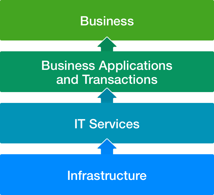
A to Z, but Many Different Paths
Interestingly, formulating this model led to the recognition that the lowest level metrics are essentially the commoditized same for every company: server response time, transactions per second, CPU utilization, etc. But as the metric moves closer to the business, it becomes increasingly unique. Every company prioritizes different values and measures different things. How they go from the low level to the high level reflects their unique business identity and culture.
Building a Metric Incrementally
The layer models illuminate two critial points:
- There is a spectrum of possible metrics.
- You do not have to start with final business metrics but can develop them through a process of iteration.
When talking to potential users, a common problem was expressed. They knew they wanted to determine business impact from IT measurements, but they did not know how to do this in any efficient way because of the distance separating the measurement from the impact and the difficulty in bridging this separation.
The metrics layer model provides a solution to this problem — it describes a path for how simple metrics can be iteratively and incrementally transformed into complex sophisticated metrics.
Applying the idea of “small steps to a goal,” an organization can begin with basic metrics, and then incrementally create higher-order strategic business metrics, one step at a time.
- Start where they are; move upwards over time.
- As the company matures it can learn to create better and more significant measurements.
As metrics develop, they become increasingly more interesting and more valuable to the company.
An Adaptable Model
The metrics layers is a conceptual construct to help companies structure their thinking. It isn't very important exactly what measurements are in which layer, only that there is an order. Each company may have different ideas for what metrics are in which layer, or what layers exist. A large company might insist that they have six, not four, levels, while a small company might only want three levels. Because the model is a tool and not a rigid conscription, it is flexible and adapts to different companies.
Primary Application Features
Executive Insight is a substantially-sized application, targeting both mobile (phone + tablet) and web/desktop, and has a multitude of designed features ranging from large experiences to small interactions. Looking across the entire system, five elements can be highlighted as vital and distinctive parts of the user experience.
| Feature | Description |
|---|---|
| Business Indicators | The metrics that are monitored |
| Indicator Collections | Indicator groupings, both derived and custom |
| Automagic Dashboards | The display of a collection of metrics |
| Intrinsic Assistance | Help content as part of the natural experience |
| The Metric Builder | Visual indicator constructor |
The Business Indicator
The most fundamental element, the nucleus of Executive Insight, is named the Business Indicator. Indicators are the values that the application measures, computes, and visualizes.
Everything else in the application revolves around them.
A Business Indicator is simply a value or ratio that the company wants to monitor, and that the business considers to be an important indicator of their company’s performance. Example metrics that customers tracked include:
- Business service response time (moving average)
- Application errors vs. user logins
- SLA conformance
- The ratio of network performance against business transactions
- Revenue per transaction
Business indicators can be either source metrics, a stream of values from one of the connected input sources, or created metrics, new values that are constructed by defining the calculation within Executive Insight itself.
Naming == Design
The naming of this entity was an important part of the overall product experience design. “Metric” is the terminology commonly used in the IT-world for measurements, and “Key Performance Indicator” is the business-world term. By naming it “Business Indicator,” the idea of translating IT performance to the language of the business is embedded in the application at a fundamental and pervasive level.

Indicator Collections
People want to view measurements together in intentional groupings that have meaning to them and their business. The very concept of a dashboard is practically defined by this.
This makes Collections, which are groups of indicators, the next most important feature in Executive Insight.
Collections As Playlists
Drawing on the ease of use, familiarity, and personal engagement of mobile music apps, Collections were designed as “playlists.” Like playlists of songs, a Collection in Executive Insight is a list of indicators that are grouped together by a topic, purpose, or another shared characteristic.
Collections are necessary in order to organize the large library, or catalog, of indicators in the system, and browsing the catalog is presented using the collections as facets.
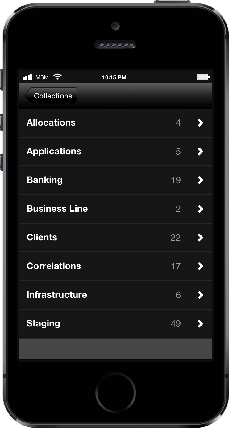
Two type of collections are available: derived and custom.
Derived Groups
The application is designed so that all Business Indicators have a variety of semantic metadata. When the application automatically creates a group of indicators using the metadata from the business indicator itself, it is a derived collection.
- By source
All metrics from connected sources belong to at least one group named for the connected source. For example, if the data comes from a web analytics application, then the source category could be named “Adobe Analytics.”
- By assigned category
Company-wide categories can be created, such as “finance” or “sales,” and measurements assigned to that category. This is a formal, top-down feature, allowing companies to create classifications corresponding to their own internal outlook.
- By tag
An indicator can be tagged with collaborative keywords, making keyword-based groups. Tags create a user-generated folksonomy counterpart to the assigned categories that reflect how the users structure the information. They are a social, bottom-up feature.
Custom Groups
Complementing and picking up where the derived groups stop, custom collections allow for more complex and intentional grouping created by the user.
- Create a new collection from scratch
Using the “Create new collection” action, a new group can be created and named, and indicators from the catalog can be added. Like playlists, a new collection can be manual, requiring indicators to be added one by one, or smart, where simple rules dynamically update the group as indicators are added or removed from the system.
- Create a new collection starting with an indicator
A person can view an indicator and then decide to start a new collection with that indicator as the first member. More indicators are added by browsing the catalog.
- Create a new collection from another collection
Any existing collection can be a starting point by cloning it as a new collection.
Once a group exists, viewing it as a visual dashboard is easy.
Automagic Dashboards
The dashboard was not a new concept. The pattern is well-established, and the basic idea of a dashboard did not need to be re-invented, per se. But the aim was not to build a new dashboard application — it was to use dashboards as a means to achieve the product and user’s goals.
Practically all dashboarding systems rely on having someone do the chore of manually laying out the dashboard — widgets need to be selected, sizes need to be chosen, a sequence has to be defined, etc. To create a dashboard, a person also needs to have visual communication skills.
In opposition to this, I prescribed that a central principle of the product design was that the application should do the tedious work so that a person could focus on their real goals. This gave birth to Executive Insight’s product goal for dashboards:
A Dashboard Must Be As Simple As Possible to Create, With the Least Amount of Effort Possible, and Allow As Many Viewers As Possible.
Executive Insight’s dashboards achieved this goal by inverting the typical behavior – instead of requiring the user to manage and layout a dashboard, dashboards are created automatically. Aka. automagically.
One Click
Influenced by new ideas in contemporary apps that generated magazine-like layouts for news stories and articles, Executive Insight was designed to eliminate the manual effort of creating a dashboard with a feature named Automagic Dashboards.
The result: a person can focus on what should appear; the application handles how it appears. That, after all, was why they would use the app, not because they wanted to create dashboards.
All that was needed was a group of indicators, and the app could display that group as a dashboard using a set of rules and heuristics.
This is why the collections are necessary. Every collection is given the option to view the grouping as a generated dashboard.
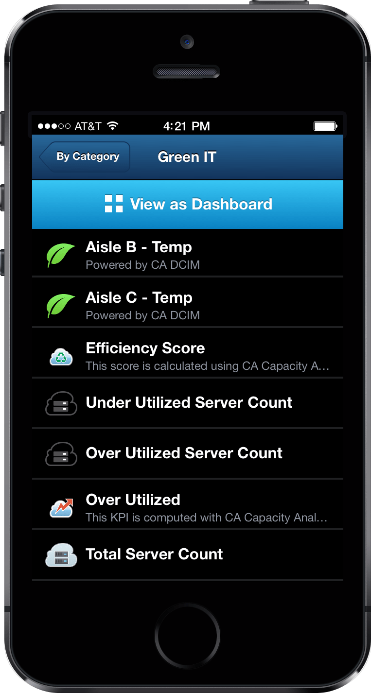
Visualizations
A default visualization is part of the indicator definition, set in the (web-based) administration/management interface.
The application started out with only a few core visualization types, selected by doing a survey of users and what types of visualizations they were using the most:
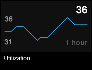
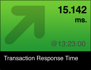
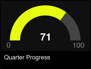
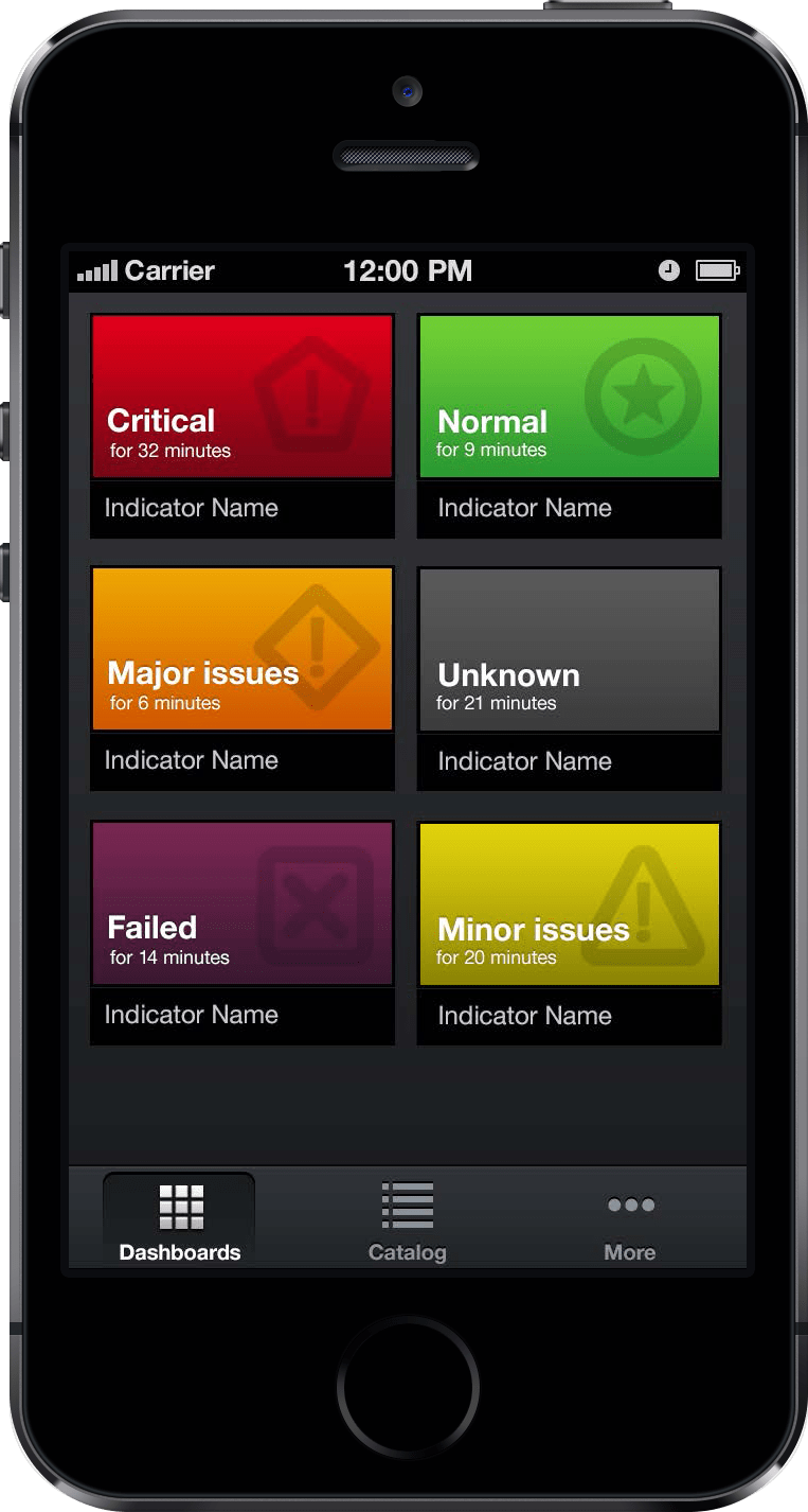
- Status Indicator (e.g. red/yellow/green)
- Line Chart
- Gauge
- Text value
The palette of widgets was expandable and extensible, and the second release added new options.
Customization
A generated dashboard is a good default. It just works. (Like magic✨!).
Nevertheless, users still want to make manual changes in some cases: the ability to have a specific indicator appear at the top was one need emphatically asked for in feedback sessions.
To provide customization, touch actions added manual revisions and overrides to the dashboard. Changing indicator sequence could then be accomplished with an intuitive drag-and-drop ability.

Intrinsic Assistance
While the Executive Insight app is designed to be easy to use, there are still features and new ideas that deserved an explanation. The broad goals of providing assistance to all users and helping them to be successful meant providing access to assistance content within the application.
Existing processes (at CA Technologies) created manuals and traditional online documentation, but access to this material requires the user to break out of the mobile app to go to a different location, and the documentation experience there was not mobile-friendly. Extremely limited mobile size limitations left little room for help text to be included within the regular screens.
The designed mobile solution was a pattern that I name intrinsic assistance: user assistance is made a part of the user experience itself.

(beta version).
Inspiration came from the gaming world where it is a common pattern to have initial encounters be learning moments that teach the behavior by leading the user to complete an actual task instead of a simulacrum.
Instead of going somewhere else to learn how to do something (as traditional help content requires), intrinsic assistance is designed to help you learn the app while working on tasks that you are already doing, appearing naturally as part of the application interface.
Benefits:
- Improves friendliness and ease of use.
- Allows the user to absorb the information at their own pace and when they are receptive.
- Converts empty states into learning moments.
Business Indicator Builder
The layering concept at the heart of Executive Insight says that a new indicator (e.g. at a higher tier) is built from existing metrics (from other or lower tiers). To create incrementally more interesting metrics, a tool is necessary that will allow people to do this in a way that is understandable and approachable.
The Business Indicator Builder is made for this activity.
Designing the Builder
In designing the application, the main idea was to make an environment intuitive and easily learned by regular people (not engineers) who do not program, but who do know Excel, the tool already being used for most business calculations.
The concept was inspired by visual tools such as:
- Scratch
- Yahoo Pipes
- Sciencepipes
- Apple Automator
Visual constructors like these have been demonstrably shown to be usable by a wide variety of users and to be intuitive to non-technical users from children to adults.

How the Builder Works
Creating a business indicator means creating a formula or algorithm that calculates a result that is meaningful to the business. Doing this follows a sequence:
- Input: Begin with one or multiple existing metrics
- Action: Apply one or more calculations
- Output: Get a result
Using blocks that are arranged visually and connected to each other (via drag and drop), a user takes inputs, combines and mashes them up, and invents new measurements.
Inputs = Existing Metrics
The library of existing metrics in the system can all be used as inputs to a new algorithm. New metrics build on the work that has been done before.
Business Constants are a part of the system, simple numbers so that a company could define values that have a name and meaning to the organization based on their current goals. An example might be target uptime. Constants could be revised over time and replaced later with more dynamic values.
Actions
To one or more existing inputs, actions are added, from basic math to specialized formulas. Each action makes one single change, which keeps the construction as simple as possible and as clear as possible.
This has the consequence that debugging is built in because a user can step through the transformation in a granular manner and preview the results.
Actions Chain Together
The output of one action becomes the input of the next action. Using a sequence of actions, very complex transformations can be made that would otherwise be opaque, unclear, and unmanageable.
Each action is one step towards the end goal.
Save the Result
The result is saved as a new compound Business Indicator, and it is added to the workload of the metric engine (the back end system handling the data).
Starting Points
The metric builder was designed to ship with OOTB models that serve as starting point examples so that anyone can start with one of the existing indicators, clone it, and revise it to make it their own.