Design and direction for a platform metamorphosis to unify disconnected sections into a cohesive, seamless experience, and inaugurate a new strategic product design vision.
The new Alpine Chorus released as the transformed version 5.0. The design vision set product direction over multiple subsequent releases.

Project Background
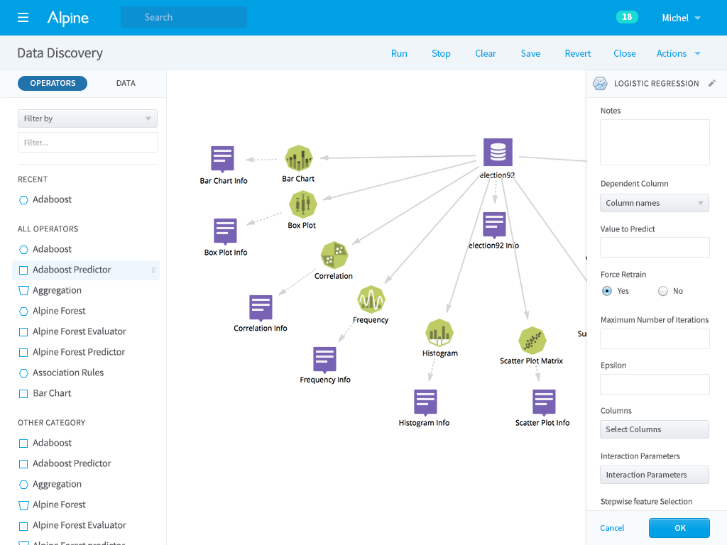
Alpine Chorus is an enterprise application for data science that brings together data, people, and machine learning into one collaborative environment, allowing teams to manage the analytics lifecycle in order to build, deploy, and use predictive analytics for business insights.
When the project started, Alpine Chorus consisted of two pieces:
- A social collaboration teamwork application
- A visual analytics construction application, known as the Workflow Editor
Project Constraints
- Limited time: 4 weeks of initial design/12 weeks total
- Small project team: 3 contract developers, 1 contract visual designer
- Existing motley user experience and UI
- Multiple disparate codebases
Project Results
Version 5 launched with the new design and improved ease of use. Over the next two business quarters, these changes were credited for a 10x increase in the subscriber base (as measured by user seat licenses).
Project Roles
As Head of Product Design at Alpine Data Labs, I was responsible for all aspects of the redesign.
- At the strategy level: for setting the product design vision and overall product experience.
- At the project level: for directing the redesign work, designing the new behaviors, and working with stakeholders (executives, board) for project approvals.
- At the day-to-day level: for making ongoing design decisions, and implementing design changes (even down to overhauling the stylesheets).
Defining the Redesign
The redesign project provided an opportunity to both immediately improve the user experience of Chorus and to construct a longer-term product design vision.
To capture both the short term and long term goals, design objectives were articulated to describe and orient the project. These objectives were used internally, and were communicated externally to let customers know about the direction and product design roadmap.
- Unify Alpine Chorus
- Improve the user experience & fix usability
- Define strategic product direction
Unify – All One Product!
The first goal was to unify the application.
Each piece of Alpine Chorus came from a different background before they were connected together. Not surprisingly, the disparate parts did not match. The differences spanned many levels — from basic visual elements of typography, color, layout to higher-order interaction behaviors — resulting in a disjointed user experience.
Although there were multiple technologies behind the different sections, the product design principle was to present the application as a single product to the end user regardless of the technology.
Disconnection is felt by users instinctually and consciously. Successful unification is not noticed at all. It is transparent.
From the perspective of the user, the sense of unification — or disconnection — is communicated by the visual, linguistic, and other experienced qualities of the application. Therefore, the primary project goal was converting both parts to have the same user experience, the same design. The new design.
In practical sequence, the collaboration environment was first converted, followed by the workflow editor. Reconciling and melding the applications spawned its own set of requirements and issues to solve, including:
- Constructing a common layout structure and dimensions that worked for all views
- Reforming the modal dialogs
- Normalizing status message display
- Revising the workflow editor operator panels
Improve the Overall User Experience & Fix Usability Problems
The second primary goal was to improve the overall user experience & fix usability issues.
A broad design objective, this imperative began with transforming the visual style to make the application more contemporary, approachable, and aesthetically pleasing. The application’s interaction behaviors were then analyzed and revised.
Fix Usability Problems
As a result of both historical development and lack of user-centric advocacy, Chorus had evolved to include a variety of egregious behaviors that hurt usability, from general web application issues to domain-specific problems.
On the basis of the initial design research, high-profile usability problems were identified and prioritized to be fixed immediately. What could not be solved in the first release was queued for future fixing.
Establish Strategic Product Themes
The third goal was to define a strategic product direction for the application.
The redesign project provided the right occasion to define and institute a core set of product themes where none existed.
The product themes began to take shape during the initial design work and resolved more completely through iteration loops as the project progressed. After the first new product release, these themes were the foundation of product work in subsequent releases (until they were reevaluated and updated).
What Are the Strategic Product Themes?
Strategic themes provide inspiration and context to answer questions of “What should the product do?” and “Why implement this feature?” They are a framework for a holistic product and strategic direction. They help make the right product/user fit.
Instead of developing reactively, a strategic direction provides a long-term view to guide product development, proactively.
Synthesized by design insight, and formed out of comparative/competitive research, the broad application environment, analysis of customer feedback, and the company’s business priorities, six motifs established the first product design vision for Alpine Chorus.
- Social Enterprise
- People use Alpine Chorus for their teamwork. The application will support social data science and collaborative business.
- Design for a broader audience
- Expand out from the core data scientist user to the entire project team and then to the wider organization that uses data analytics.
- Consistency and Coherence
- Alpine Chorus should be consistent and coherent throughout the user’s entire experience. It is one product, not multiple products.
- Provide value in every experience
- All moments spent with the application are valuable — the application should deliver value and meaning to the user at every interaction and moment. There should not be any wasted interactions.
- Personality
- Alpine Chorus should have a personality that will contribute to making it a unique, positive experience.
- Delight
- The application should deliver delight to the user, from micro-interactions to macro experiences.
Design Research
Design research at the beginning of the project (and iteratively throughout) set up a baseline for the product, using a selection of techniques appropriate to the time and resources available.
- Comparative and competitive surveys
- User and stakeholder discussions to gather feedback and insight into usage
- Simple ethnography
- Heuristic review
The results of these efforts provided a way for everyone involved in the project, and then everyone in the company, to gain a broader view of Alpine Chorus as it presented to users, to companies, and in the market; and to understand the design changes in those contexts.
One outcome of the research was an end-to-end user journey map that modeled the (existing) user types, how they use the application over the course of a project, and how it fits into their work process.

User Experience and Usability Changes
Fixing the Selection Behavior
The most flagrant usability issue in the application that needed immediate resolution was a selection behavior that confounded users (and belief). In a list of items, whether files, datasets, or jobs in a workspace, there were two different, independent selection actions available. A person could:
- select an item or multiple items with checkboxes
- select an item by clicking the row element
For each selection set, a collection of respective actions would display for the user to act on the items.
Also, all lists first displayed with the first item pre-selected.
This behavior was clearly confusing to everybody, evidenced by the feedback, customer service questions, and logged feature requests — a conclusion supported by the heuristic review.
To fix this, the double selection was removed, and selection behavior was redesigned to have simple, logical, and consistent behavior rules. This pattern was then applied throughout the entire system. Selection behavior became usable and understandable.
Application Navigation and Context
Originally, there was no practical overarching navigation for the application. When a person signed in, the first page was the application home page, and navigation was accomplished through links embedded within the page.

Legacy Home Page Problems
- Data sources
- Links to browse all data sources, and to add a new data source.
- Project workspaces
- Links to view all workspaces, and to create new workspaces.
- User profiles
- Link to browse all the application users.
In addition to not providing any orientation about the structure, this made it difficult and awkward for users to get to a specific location in the application, even from the home page. And from an internal page? A user had to go back to the home page first.
These problems were fixed by the introduction of a ubiquitous primary navigation menu that served people’s expectations and needs.

Adding primary navigation had additional significance because it made possible the later project of converting the home page into a personalized dashboard (see: Home Page Dashboard).
Navigation and wayfinding changes were also made within the application, particularly on the heavily used workspace pages where the project context (i.e. the workspace name) was made a persistent page element. This resulted in an improved, clearer sense of “you are here” when working.
Voice and Language
Words are important. Most of the conscious interactions that a user has with a software application happens through the words used in the interface. Consequently, the words themselves are a critical piece of the user’s experience and impressions with the application.
To revise the experience of Chorus, the language also needed to be rewritten.
In the same manner that the visual language was developed by first figuring out what impact the visual style should create, the written language needed to start with a definition of what it should evoke.
Through a series of short discussions and feedback surveys, a tone and voice model was composed to establish the attitude, personality, and character of how the application should “speak.”
The next step was to audit and take stock of all the existing text. This was necessary in order to sort, group, and digest the quantity of individual text units (i.e. each individual word, phrase, or sentence) that were spread across different features and experiences. When grouped, similar and related text could be more easily compared, evaluated, and rewritten. Differences and problems that would not otherwise be obvious become readily apparent.
One example: labels and messages indiscriminately used “delete” or “remove” without distinguishing between (a) an operation that erased the item completely or caused it not exist in any form anymore, and (b) an operation that would take the item out of the current context without deleting it elsewhere/in other contexts. While these terms might be generally held to be synonymous, I felt that there is a critical difference between them that is very important in the context of a data-centric tool, where “deleting” a data set has significant real-world consequence versus the non-destructive action “removing” it from a particular workspace. By rewriting all of the action names and using them consistently, the application became more internally sensible and comprehensible.
It was not possible to rewrite all of the interface in one release, so the revisions continued incrementally over several releases, guided by the language and voice definition. A manual of style (a guide) was also created to be a reference and documentation resource for the entire organization.
Technological Note: I18N
Making text changes was inordinately easier because of the engineering best-practice that required all of the interface content to be in discrete language files. Formally for internationalization (i18n), this structure provides a valuable degree of flexibility because copywriting and copyediting can be decoupled from the regular development stream and can be done by the design team instead of the development team.
Aesthetic Changes
Visual Design Goals
- Simple, clean, modern look and feel across the entire platform
- Visual unification
- Establish the visual design language foundation and new style guide
Color
At the root of the new application look, the new color palette was simple, clean, and modern. The initial palette was intentionally limited, and then allowed to expand slowly over subsequent releases as the design language matured and holistic changes were easier to make.

Typography
Previously a mixed set of text fonts were used in the applications. They were replaced and standardized across the entire platform with a single family, Source Sans.
Its humanist-derived style complemented the new design, and it has a wide range of weights that provide flexibility in different interface situations. As an open-source webfont, its licensing and availability were compatible with the business requirements and technical restrictions of Chorus (i.e. on-premise installation, behind firewalls).
Text sizes, styles, and formatting was then normalized across the entire application.
Graphics and Iconography
Once the interface style and palette changed, the graphics used in the interface needed to change too.
An audit of image use identified that there were two classes of graphics (as is typical):
- General and generic graphics representing behaviors of the application itself.
Generally, these are icons used with application actions, graphics related to the application structure, or communications from the application to the user.
Examples: open, close, configure, alert message marker, loading in progress.
- Graphics specific to the application or content created by the users.
These are graphic elements whose presence is dependent on user actions. Generally, these are graphics used for content and things that are part of the work being done with the application.
Examples: data sources, machine learning model, workspace documents, automated jobs.
General Graphics and Icons
The first category is reasonably universal and common to many applications. To standardize these with improved visual consistency, take advantage of resolution independence, and to improve the total application load time, all general image files were replaced with a glyph webfont.
Unique Graphics and Icons
In category two, the context-specific graphics and icons needed to be re-designed and re-created by hand to work with the updated application. With pictograms and ideograms as the inspiration and influence, imagery was simplified and flattened visually, eschewing the faux 3-D of the older graphics.
The new icons were created to be familiar and easily identifiable. When representing an element that has an external existence (e.g. a commercial database), the imagery directly references the external identity (e.g. a version of the logo). When the element is unique to Chorus, it was kept as simple as possible. The icons for a job, for example, use circling arrows to represent the concept that a job can be run recurrently. Within the arrows, a clock distinguishes a scheduled job from the “play” icon of an on-demand job.
Where possible, SVG formats were used to deliver the best possible resolution.
This work done to redesign the general application icons was a prelude to the subsequent work of redesigning the entire family of machine learning operators in the visual data science programming environment (see: Operator Iconography).