Alpine Chorus, a data science application, has over 90 machine-learning operations that are accessed in a visual, drag-and-drop editor. Each operation has a unique icon, from loading data through to prediction and final analytic output.
The entire library was redesigned to make a coherent, learnable, and more usable family of icons.
What Is a Workflow Operator?
Alpine Chorus enables people to visually build sophisticated analytics workflows as a sequence of tasks and algorithms that are connected together and applied to data from a variety of sources, such as a Hadoop cluster.
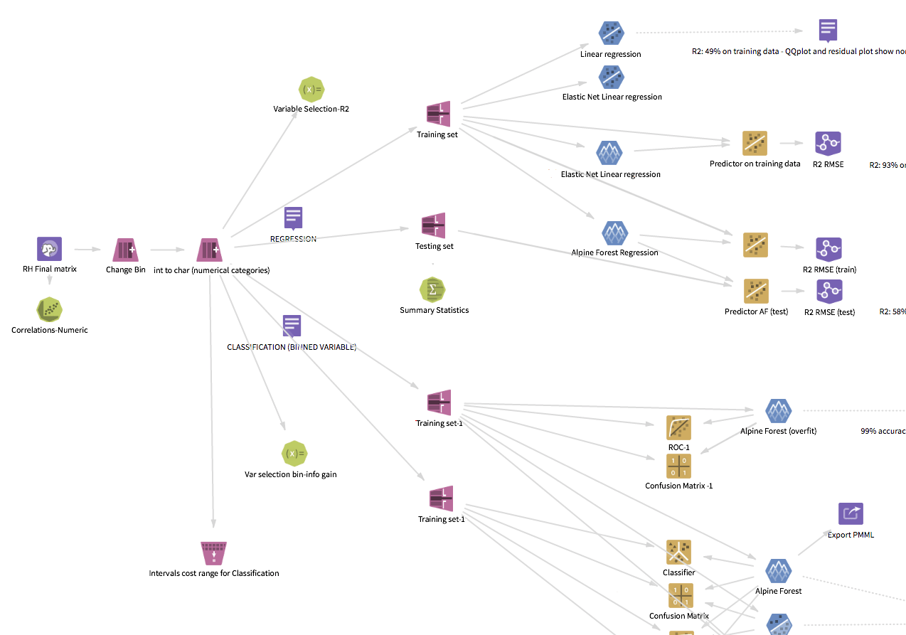
Workflows are assembled using a drag-and-drop visual programming environment known as the workflow editor, where each machine-learning function is represented by an icon — the “operators.” Each icon is a step in the process, starting from the input and leading to the conclusion (see Alpine Chorus Strategic Design for a view of the workflow editor).
The Visual Principles: Machine Learning Made Iconic
Like any large body of work, no single technique was sufficient to create an image for every icon. Throughout the family, many different approaches were used and the results range across a spectrum from the literal to conceptual abstraction.
Principles for the imagery:
- Learnable and memorable
- Recognizable
- As simple as possible
- Must work together as a holistic family
- Symbolic, not realistic
- No words; letters and symbols allowed when applicable (e.g. formulas)
- Maintain connection to the old when appropriate
Continuity
Some of the new icons were closely based on the older version of the same icon, translated into the new visual style. This provided continuity to users when upgrading.
More importantly, where the original already used the most recognizable symbol of the operator’s function, the imagery did not need to be reinvented.
The Box Plot operator visualizes the input data’s statistical attributes as a box plot. This is a standardized way of displaying the distribution of a dataset, and the distinctive whisker is an immediately recognizable figure to the audience. On the icon, the whisker is used to represent the whole (synecdoche).

Recognizability
The commitment to recognizability is perhaps the most important of the guidelines.
Because of the specialized domain and audience for the application, “commonly known” in this context means "within the specialized world of data science." The user profile for this environment axiomatically establishes familiarity with the underlying functions, whether deep knowledge (bona fide data scientists) or basic understanding (analytics consumers).
The linear regression modeling icon takes advantage of this. It displays an idealized representation of the algorithm’s results (and that itself is a graphic visualization).

Learnability
Pivot and Unpivot demonstrate a different way of communicating the concept.
In both Pivot and Unpivot, the arrow communicates change. Most of the transformation category operators use some variant of this approach, where the process or action is indicated in some manner.
While there may not be an innate sense of pivoting a data set, the action arrow creates a visual connection to the transformation involved and an image that is learnable.
Abstraction
Some icons need to represent a process that has no intuitive visual equivalent, where there is no generally accepted visual identification, and the function does not have any representations outside of the underlying math. Many of the more esoteric machine-learning algorithms fall into this group.
In these cases, conceptual abstraction is necessary.
The AdaBoost algorithm, for example, has no visual equivalent, no typical image result, and no simple explanation. For the AdaBoost operator, the design concept represents the algorithm’s process of classification using multiple iterations of other classifiers and uses the progression of bands (vertical and horizontal) to conceptualize the movement toward the visually weighted center.
Abstract imagery is the most difficult type of imagery to use since the person will not have any instinctive understanding of the icon. However, the requirement to be visually distinctive will allow the person to form a connection through usage, making it recognizable.

A Few Inspirations
When gathering ideas for the icons, innumerable sources fertilized the ground for growing ideas. A few of them are:
Elements of the Visual Language
The visual language gives form to the graphic ideas.
Basics of the Visual System
Continuing the visual direction and transformation started in the platform redesign project, the operator icon style took inspiration and influence from pictograms and ideograms. Added to this were a set of guidelines for the visual attributes:
- Flat
- No gradients
- Lighting is straight on, not angled
- No shadows
- Restricted foreground palette
- Single background hue
- Consistent representation of standard elements
- Consistent stroke weights
- No animation (within the icon itself)
A Handful of Standard Elements
Taken as a whole, there are certain basic elements that are common to many operators, regardless of the function or algorithm, related to their shared domain of machine-learning.
To take advantage of this, a collection of visual building blocks were used throughout the entire family, contributing to the shared visual language of the operators. Data, for example, is represented throughout the collection. The data element appears in over thirty percent of the icons, from an entire table (the sampling actions) to an individual mote (null replacement).
Color: Hue
The operators are organized into seven primary categories:
- Source/Tools
- Exploration
- Sampling
- Transformation
- NLP
- Modeling
- Prediction
Each category has a unique hue, and each icon has a solid color background according to its category.
In addition to the basic aesthetic appeal, the color becomes a learned quality that helps the user work with the application.
Color provides mnemonic identification by type (i.e. category of function), and the ability to organize the operations. At a high level, color coding allows a person to follow the general process of an analytic workflow and to parse the process, from the initial data input through modeling and prediction.
An interesting benefit of this is that images of the visual workflow are used by data scientists in presentations to document and explain their work to other people.
Color: Saturation and Brightness
For the categorical colors, saturation and brightness have been controlled for uniformity over the entire family. The rationale for this is to balance distinction and usage habits.
This design decision balances distinction and usage habits, optimizing the experience for extended periods of usage (since the typical data scientist session is several hours long). Toning down and reducing the saturation and brightness creates a more neutral holistic visual display and minimizes visual fatigue.
This also reserved higher saturation for specific cases: the selected state of the icon is subtly more saturated and brighter, befitting the intended attention focus.
Foreground
On top of the category color, the foreground imagery uses only black and white, applied in specific transparency steps to render the intended idea.
Shape
In addition to the main hue–category connection, each icon category has a distinct base geometry which reinforces the identification. In some cases, shape is even varied within a group to add an additional level of differentiation. Both data input and flow control are in the “tools” category, but their shape is different, even though they are both four-sided. In the transformation category, four trapezoid variations are used.


Also, Operator States...
Each operator icon also has four states that change contextually in response to user actions while editing the workflow. The states convey the relationships or possible relationships between the operators when an operator is selected.
States are applied as visual treatments of the base icon.
- Normal
- The default state. The operator can be selected, changed, or run.
- Disabled
- The operator is disallowed or not able to be connected to the currently selected operator.
- Targeted
- The operator can receive a connection from the currently selected operator.
- Selected
- The operator is currently selected.
Ultimately, the Eye Must Decide
Icon design is a design world unto itself, where the macro-design rules are sometimes insufficient or need to be bent, and empirical perception is the final law.
Constructing each icon using the defined palette and drawing the imagery within the style guidelines resulted in an icon that matched the others. This did not necessarily result in an icon that was finished. Each image needed to be assessed individually. Changes were made to every icon below the threshold of “noticeable” to make a final result that was still the same image, but that worked at the size of 60 pixels (the display size in the workflow editor). This was the final visual optimization step.
A 65% opacity setting for a black element (representing a piece of data) might work well visually when the background is medium blue, but not well enough when the background is amber, and the opacity needed to be changed to 68%. In another case, the imagery for the PCA (Principle Component Analysis) algorithm is the same for both PCA Modeling and PCA Predictor. But the two are not the same icon. The larger size of the predictor operator caused the elements to look awkward. To resolve this, the proportions were changed very slightly, and some of the elements were shifted a pixel or two so that they maintain equilibrium.
About Design Tools
From Paper...
In the cases where new visual imagery needed to be created, pen and paper sketching was usually the first step for visual thinking, accompanied by abundant research. A whiteboard is invaluable, as well, for collaborative sessions and thinking in a larger format.
...to Vector...
Eventually, the production process moved into Adobe Illustrator for high-fidelity work and the final icon development in a vector format. Practices for working with vector icons include two important rules:
- Constructing in vectors is nice, but viewing in “Pixel Preview” mode is the only way to avoid the pitfalls when an image moves from vector to raster.
- “Align to Pixel Grid” is a must-use setting.
Exporting from Illustrator as a vector image gave the default normal state icon file.
...to Pixel
Because of my opinion that Photoshop offers more control and consistency over image effects, and also because of an easier ability to construct a batch process, each normal state icon was then processed through a custom Photoshop action to create icons for the other three states.
Finally, lossless image optimization (variously: imageOptim, pngquant, tinypng, PiedPiper compression) whittled the files down to be as svelte and speedy as possible.
The Final Operators
The final family comprises a body of 92 different icons in seven different categories. Here are 85 of them.