Design direction and contributing user experience work to redesign GovernanceMinder, an application for managing user entitlements and privileges within the enterprise.
Project Background
Originally named Role and Compliance Manager, the business line that owned the product wanted to change the name of the application and use that event as an opportunity to transition the application to a next-generation product with a redesigned user experience.
Project Roles
As product design creative director, I reviewed and collaborated on the entire project, and contributed interaction design and interface design. The full design team included Kristen McCarthy, design lead/manager; Allison Corbett, interaction designer; Josef Bodine, visual designer; and Anhtram Nguyen, design engineering lead.
The Project
After a research and discovery phase to understand the current state of the application and then to define a product design vision, the work focused on the three primary user home pages and on the core certification workflow process.
Design Goals
Informed by the research, the high-level product design goals were defined to cover the most important issues that needed to be addressed:
- Improve usability
- Design the experience for Compliance officer as a role
- Improve self-service
- Reduce steps/friction to completion
- Match user needs
Home Pages
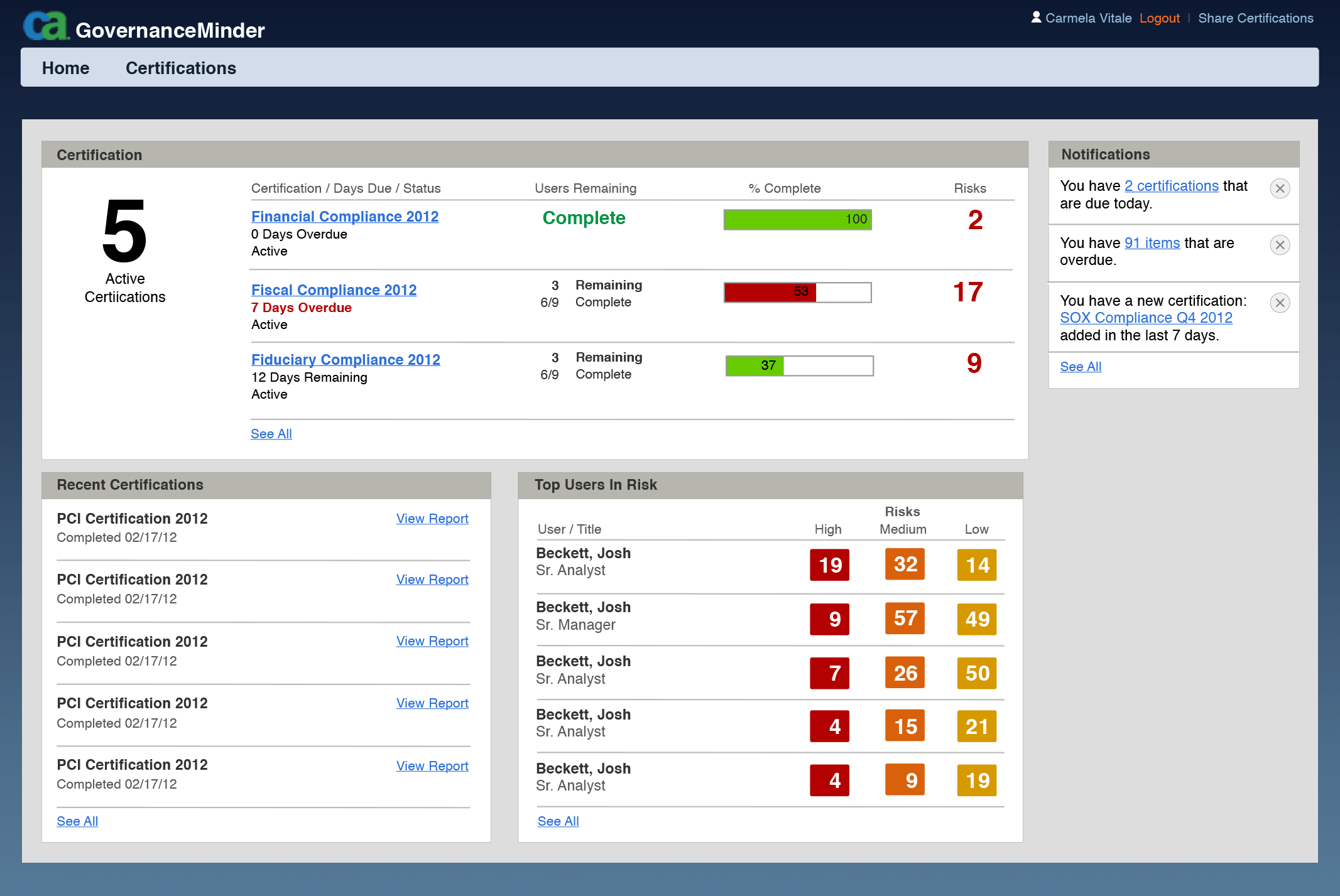
The home pages were redesigned to deliver an overview of the current certification and compliance status to the Business Manager, the Certification Auditor, and Compliance Officer, three roles that, respectively, reviewed the individual certifications, oversaw certification and compliance, and held responsibility for overall compliance in the (customer) company.
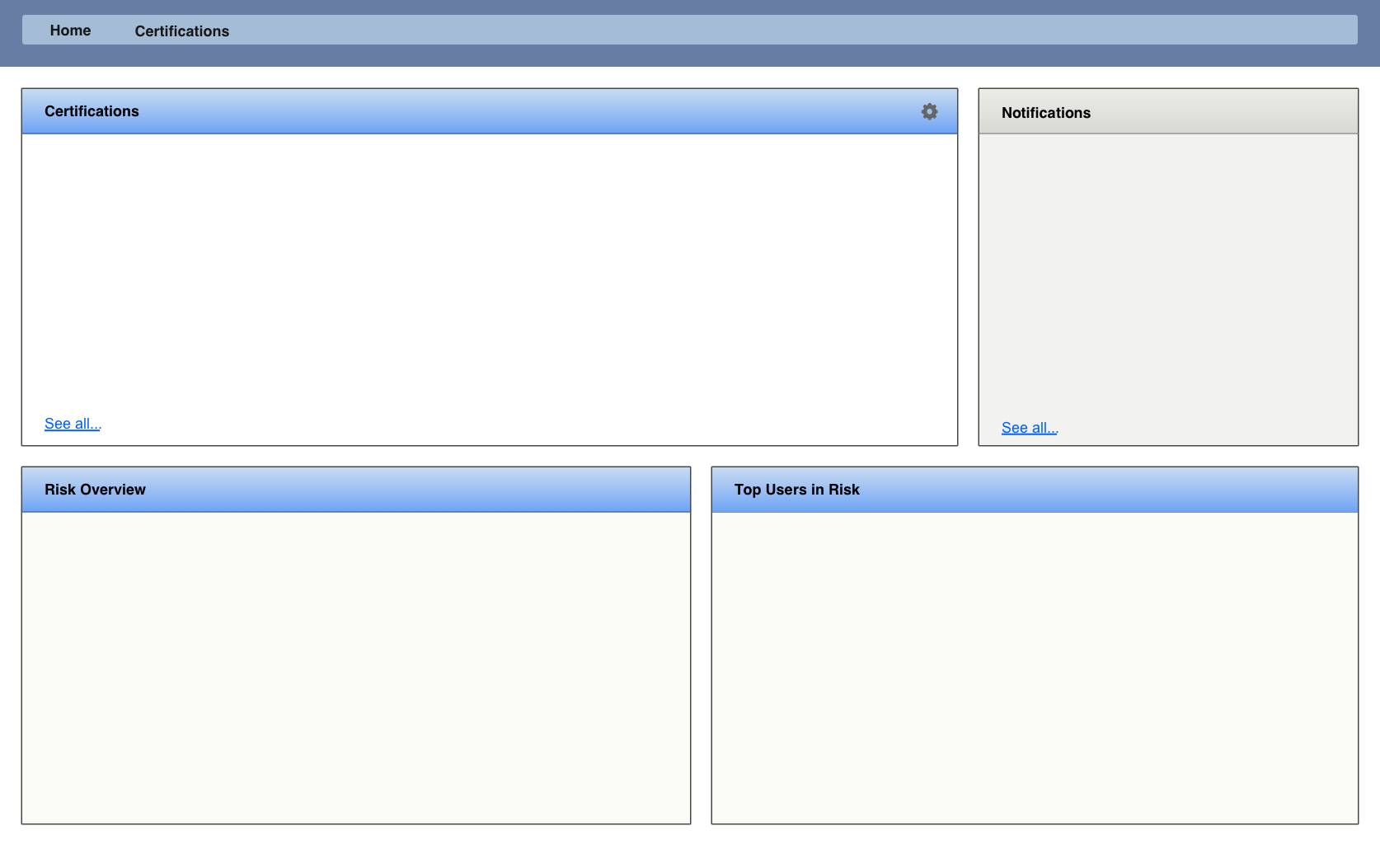
The solution established a modular page format whose contents changed according to the user role, along with common elements like notifications/messages whose content was specific to the recipient.
Certification Review
When a new certification is begun, business managers were automatically invited to review and verify the privileges of the users and resources they supervise. These assignments would list on their home page, from where the review process could be launched.
Broad Design Improvements
To deliver a better holistic application experience, many general features that spanned across different tasks also needed to be redesigned.
Search
Search is an element of the certification review context for the business manager, who used search to find specific people or entitlements within the assignments of an individual campaign. Changing search meant changing how search results were formatted and organized. Principal terms were identified and weighted according to the user’s expectations and real-world searching patterns, so that, for example, searching for a person’s name would display results that listed that person’s account first before listing all entitlements that linked to that account or who that person reports to, as had been done previously.
Contextual Information
Because of the complexity of information potentially necessary for each review decision, an application pattern of contextual “hover-reveal” was employed to impart contextual information. With a basic pop-up layout template, twenty-seven different cases were analyzed, rationalized, and designed.
Design Detail: Batch Certification Process
Business managers are required to review and approve the entitlements for the people that report to them, and those results would roll-up to their own managers in the organization. A typical review would comprise hundreds of entitlements, even for small teams.
The time necessary to complete such a review is a significant cost for a company and user feedback suggested that it was both overly complicated and overwhelming.
Rather than simply overhaul the existing review interface, the basic process itself was questioned during the design process:
- How do the business managers approach the review tasks?
- Is there a better model for this?
- Is there a way to make this process easier and more pleasant?
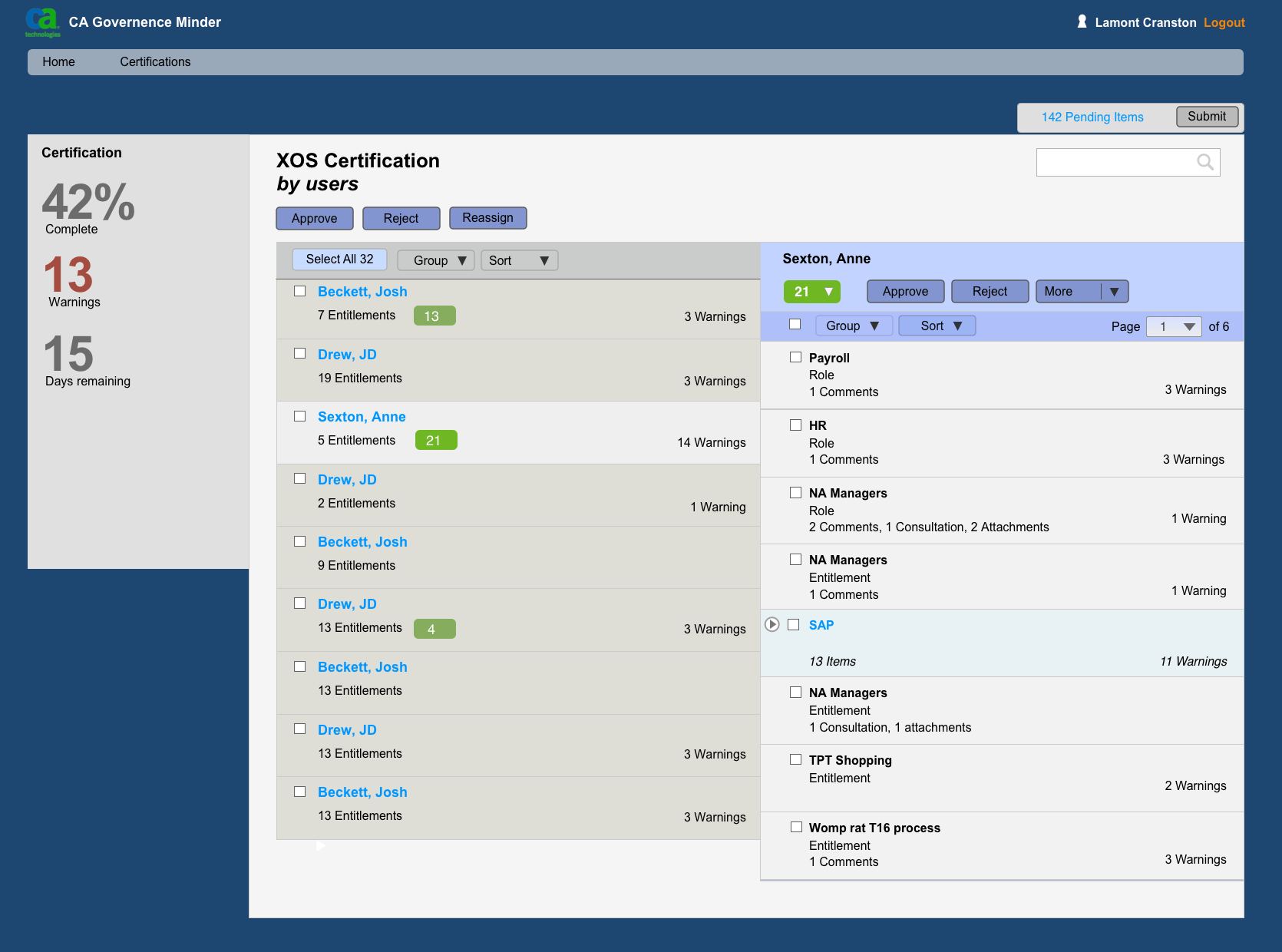
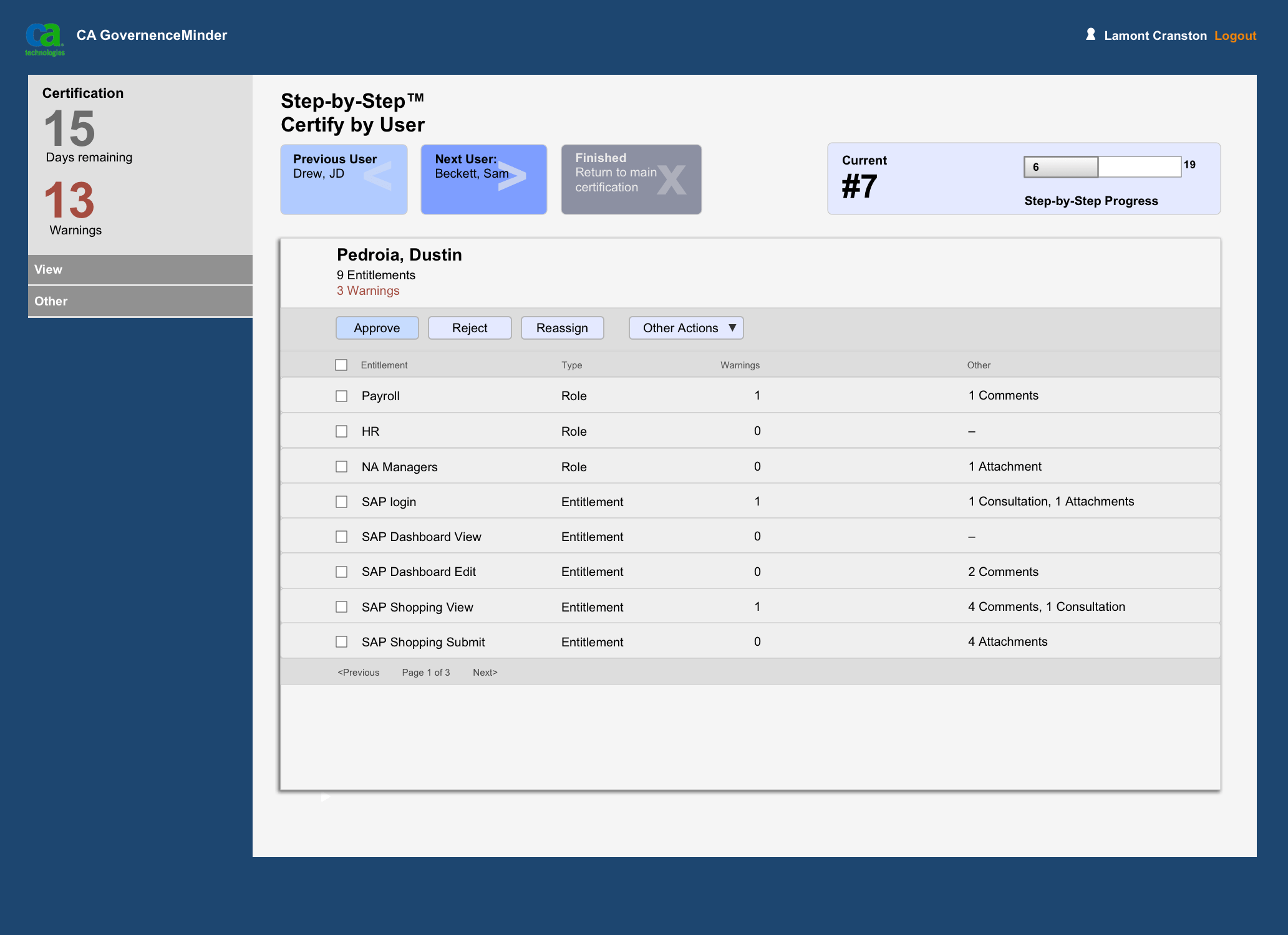
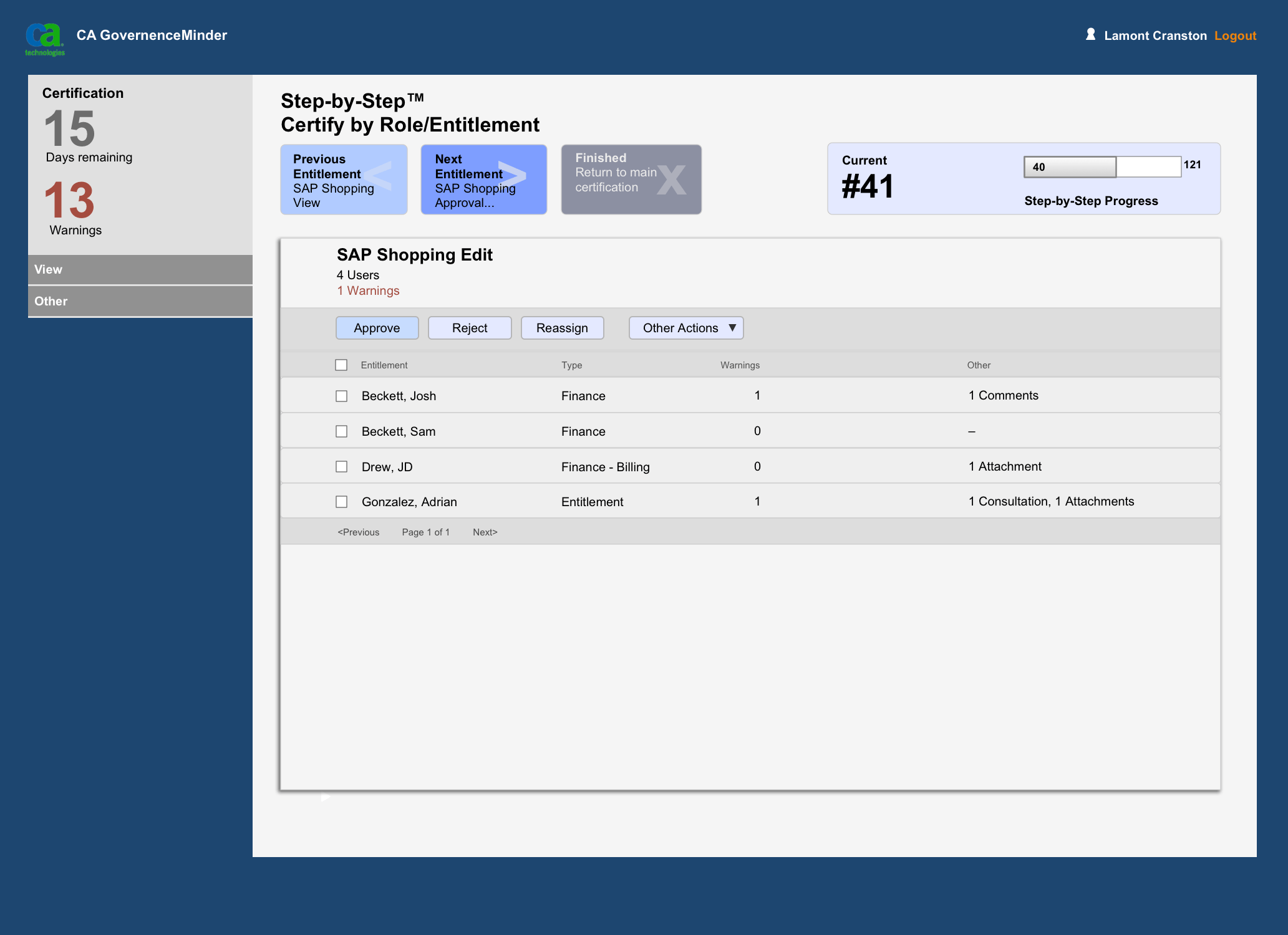
These questions led to a new answer for the process. Instead of a single (long) list, the review tasks could be presented in faceted “chunks” or batches that have meaning to the reviewer — either grouped by each user, showing the entitlements that user has, or by the entitlement, showing all the users with that entitlement.
This takes advantage of the human psychological capacity for processing information at any one time: working with multiple small sets of information is easier and more effective than working with one very large set.
This also creates a focused experience, adapted to the context. Once grouped, the business user could more easily work through all of the certification tasks. Furthermore, the segmentation provided natural breaks in the process where the user could stop and continue later with less mental burden than the one-single-list model.
This new process was given the moniker “Step-by-step” to distinguish it as being different and new to the application. A name also helps to make it more friendly to the user.
